"In
this project I've had great fun using the translucent paints with masks. I
originally had in mind a circle design, all overlapping, but then I tried out
this scribbly mask (Webbing Template by Crafters Workshop) which I bought ages
ago but have never really used, and it was perfect. So, it's worth having a go
with lots of different designs just to see what they look like".
I've
used blue and green paints here because I knew they'd blend well, but any of
the translucents will work. Go for a combination that you like. I've gone for
just two layers of paint and one mask, but really, once you get going, you
could try several different patterns and colours layered up on top of each
other.
Prep
your Wooden Icon Triple substrate with the Snowflake
paint.
Stamp
the "Tailor" image onto white Crackly Tissue Paper and lay over the wet paint:
When
dry, stamp the other images, masking where necessary.
Lay
the mask over one corner and start sponging through the design with theLimelight paint
Don't
use too much paint on the cut 'n' dry or it gets very blobby. It's also useful
to spray the back of the mask with a removable adhesive as this helps keep it
in place. Repeat
until the background is covered. {I
just looooove that colour! }
Then
reposition your stencil twisting it slightly and sponge through with BeachHut.
Next
I started to paint the main image, painting over the top of the tissue paper.
However I didn't like it very much, especially
the flowers, but no problem ....
I
just stamped the image onto tissue paper again, painted the colours on the
back, let it dry and then covered the back with Snowflake like this.
You
can see from this that the tissue paper is so translucent that if you wanted a
mirror image you could just use the pic that's come through on the back (only
exception is if there's text).
Then
just line it up exactly with the image already on the triptych and stick down
with Satin Glaze.
Love
those button corners - the black ink works really well with the bright zingy
colours.
Next
I thought I'd try the mask technique using opaque paints (in this case Mermaid
and Guacamole). After I'd stencilled I then added stamping in black but didn't
like the effect too much - the green made it too much of a 'camouflage' pattern
which I didn't like so I whipped out the sandpaper again and sanded it right
back to give a softer effect.
Still
not quite happy (the black was too strong, but of course, being StazOn Ink, it was
also permanent!) I then dipped the sandpaper in Snowflake paint and rubbed that
over the top.
and
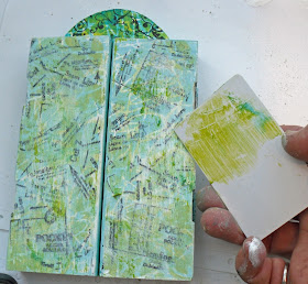
then picked up a credit card I'd been using and scraped in some Limelight
highlights:
{Much better}
To
finish off I stapled an open ended zip to each side using a staple gun. The zip
itself was too long but I just cut off the top and put staples close to the zip
teeth to stop the zipper shooting off at the top!
Then
add a few stitching embellies which can all be painted to match.
I'll be back tomorrow evening with one more project .... remember that plastic card!!!
Helen!
Remember if you want to play along with the GD challenges this week, click HERE to share/upload your project.
Leandra Says: Love the zip!! And that squiggly stencil is a pretty cool stencil too...a girl can;t have too many stencils now can she!!
Gillian Says: Fantastic effect from the sand paper/paint and I just love that crazy stencil pattern.


I have that mask too and have never used it - what a great look! Thanks for another fabulous project, Helen.
ReplyDeleteLove the stencilled pattern with the translucent paint. I admire how you go on and adjust until you are happy.
ReplyDeleteMargriet
An absolutely fabulous project, just love the addition of the zip - wow! Anne x
ReplyDeleteThe zip idea tickles me ! Brilliant project.
ReplyDeleteThe zip is such a cool idea, and I love that shabby exterior!
ReplyDeleteAlison x
Love that zip idea. Fab and fun. Great tips, thanks
ReplyDeleteFabulous!!! xxx
ReplyDelete