Hi everyone, Ann (aksbarchitect CREATES) here with you today. I feel like the days and months tend to go by faster and faster as I get older, and I find myself wanting it to slow down. Summer in the U.S.A. has come and gone and we are now officially in the season of Autumn.
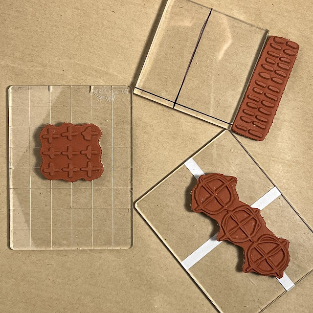
Not quite wanting to let go of those summer vibes, I decided to create a bright and airy art journal spread highlighting the wonderful Kate Crane stamp set (KC005) (available from a PaperArtsy Stockist) filled with different mark making stamps.
The current topic, White, gave me the perfect opportunity to keep everything clean and bright, and as I began to create pieces that I would be collaging into my journal, I thought it would be great to experiment with different ways to allow white to take a leading role.
Whenever I work in my art journal, I don't usually have a final vision in my head, I tend to let the pages go wherever the art leads, this spread was no different. The inks guided my color choices, and then I let the composition flow.
I think one of my favorite aspects of this journal spread is the way that I was able to take the stamp designs and create repetitive patterns with them. The patterned paper I created could then be torn or cut into perfectly sized pieces for use. Many of the Kate Crane (KC005) stamp designs consist of small groupings of shapes and marks. Repetitive stamping can easily modify the appearance, creating your own designs. I look forward to sharing some of the tricks I use when doing this.
I love working with inks, and am generally up for trying new and different products. The current PaperArtsy theme: Nature, gave me the perfect opportunity to play with some special inks that were derived from nature; or plants and bugs, to be exact! These inks from Fiber&Mud were so fun to experiment with. I also used VersaMark embossing ink, Ranger Industries Embossing Powders - white and clear, PaperArtsy Fresco Finish Chalk Acrylic - Snowflake (FF15) and white POSCA paint pens.
I began with a blank page in my Mixed Media Art Journal. I don't usually gesso my pages when I am using inks, I like the way that the unaltered paper absorbs both ink and water. Since I know that I will be highlighting the color white, before I add any color to the page, I go ahead and stamp the triple circle with axis lines multiple times using VersaMark embossing ink and then heat emboss the images with clear embossing powder. These images will appear as white when I add ink and water since the embossing will create a resist.
I love the way that the inks settled around and within the stamped images, in some cases remaining quite pigmented and others diluted. Within the divided circles, the colors vary and create a lot of interest.
I can't wait to begin adding more collage elements to the page to give it structure and carry the eyes across the spread. It's easy to create elements that coordinate by using the same colors with a different stamp or stamping medium.
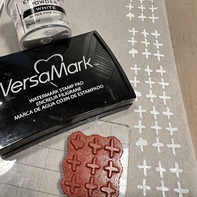
Using a base of wet strength tissue paper that I have colored with Fiber&Mud ink and allowed to dry, I align the stamp onto a clear acrylic block. I always try to line up at least one element with the grid pattern that is etched into the acrylic. If your stamp block does not have the grid pattern, you could create your own lines with either a Sharpie marker or even with wash tape. The point of alignment is important as this is how you will be able to line up rows or columns and easily create a repeat pattern.
Stamp the initial image onto the paper, then move the stamp (vertically or horizontally) adjacent to the original stamped image. It's a good idea to note approximately how much space you need to leave as a gap between imprints to create a continuous flow. Using the grid (etched or improvised) align the design and stamp again. Depending on the type of ink you are using, you may need to re-ink your stamp between each step. When in doubt, it's always a good idea to re-ink prior to stamping a new section. Once you have created/completed the desired pattern, Coat with embossing powder and heat emboss.
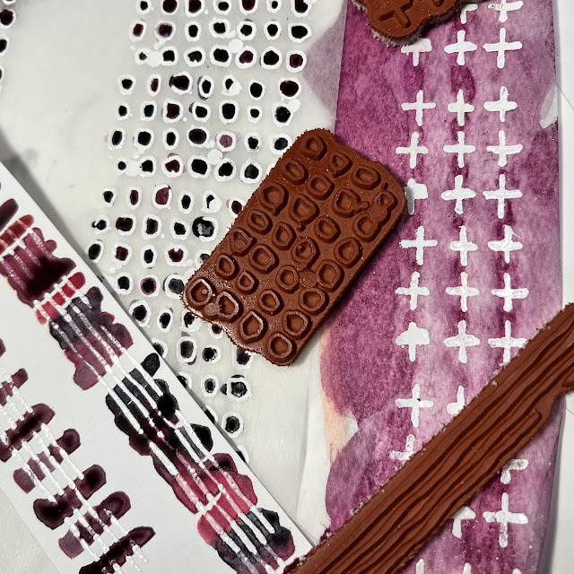
I created another long pattern on white tissue using the tiny open circle stamp design with white embossing. These little circles were so fun to drop a bit of the Fiber&Mud ink into and let dry. The random intense color inside gave this pattern an entirely new look.
I also stamped the long lines image onto white cardstock and embossed with white. After the heat embossing had cooled, I used a paint brush to paint swaths of ink perpendicular to the white lines.creating a brand new pattern.
When I have an assortment of patterned papers complete, it is time to start laying out the pieces. The top left and bottom right corners containing the sectioned circles and flowing ink areas create the background, and dictate the direction of the layout.
I want to keep my pages fairly monochromatic with the Indigo and Cochineal Purple tones. When I search through my stash of papers, some botanical images catch my attention. These will work with both the Nature theme and my color scheme. I start with a large block of color towards the center of the page and work my way out, trying to work in both directions outward to maintain balance. Many collage artists have a personal style. I have learned that my style always tends to be axial (containing horizontal and vertical elements). I also have a thing for using circles in my art. You will see many of these elements in my work.
Once I have all of the pieces attached, I add some PaperArtsy Fresh Finish - Snowflake (FF15) splatters to both pages using a Distress splatter brush. Once the splatters are dry, I then go back and add small details with gold. I love how this spread turned out. The way that the botanical elements tied in with the "marks" was refreshing. I don't often use a lot of white in my work, yet after completing this piece, I may rethink that. I love the clean look that is achieved when using white.
It is always fun to create in my art journal. I find it a great place to experiment with new techniques or even just to practice making art each day. Whether you work in a journal on a regular basis or just sporadically, or even if it is something you have never done, I highly recommend trying it. It's a safe place to create that never has to be shared, if you don't want to. If you find you create something that you are very proud of, you can display it. There truly are no rules. So grab your supplies and enjoy the experience. Thanks for stopping by today. ~Ann
Facebook: Ann Sullivan Barnes
Instagram: @aksbarchitect
Pinterest: Ann Sullivan Barnes


Beautiful work in your art journal! I love the orderly compositions and the ink colors then complemented with the florals pieces! They go together so well that it makes me happy; very pleasing to the eye. A lot of wonderful tips and it is much appreciated. And that's a great mark making set of Kate's.
ReplyDelete