Hi everyone it's Keren Baker, here with you today.
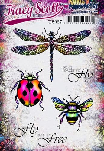
I'm a big fan of Tracy's artistic painterly, dimensional and doodled style. Her use of colour is always carefully considered and exuberant and her love of colour resonates with me.
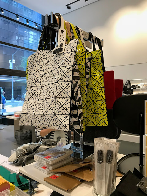
I wanted to use Tracy's Lace booklet as part of this project and it also fitted perfectly with our running theme of texture. I had a bag in mind for my project - inspired by a style I'd seen in New York a few years back by the designer Issey Miyake. The tiled and textured bags that move beautifully as the wearer moves.
As you'll see- there's little similarity with my final piece other than the connected tessellated shapes.
It turns out that it was more of a clutch bag and way more 'involved' than I usually do...and how did I manage to connect all of those shapes?!
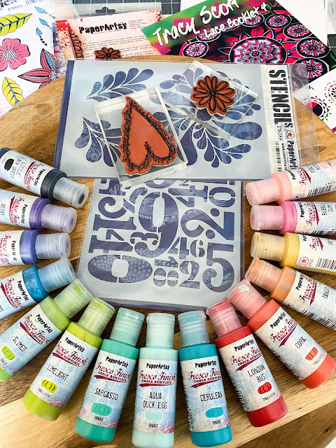
Getting started was relatively straightforward. I didn't get any more paints, as I knew I had enough bright colours in my stash already...(I've been collecting for years!). So I laid out as many bright rainbow-y Fresco Finish Acrylic paints and thought I'd let the colours speak to me.
I knew I wanted to add stencilling, a Lace booklet and some stamped focal images to the piece, so I just needed to take the plunge and get some colour down.
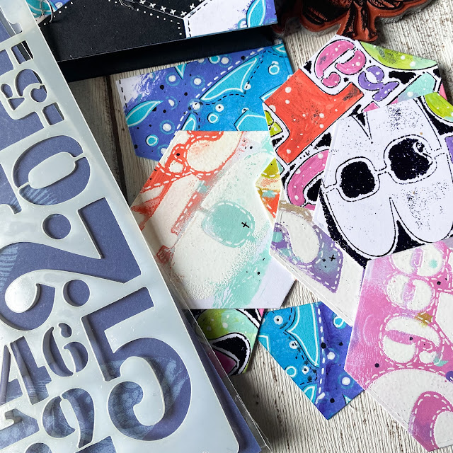
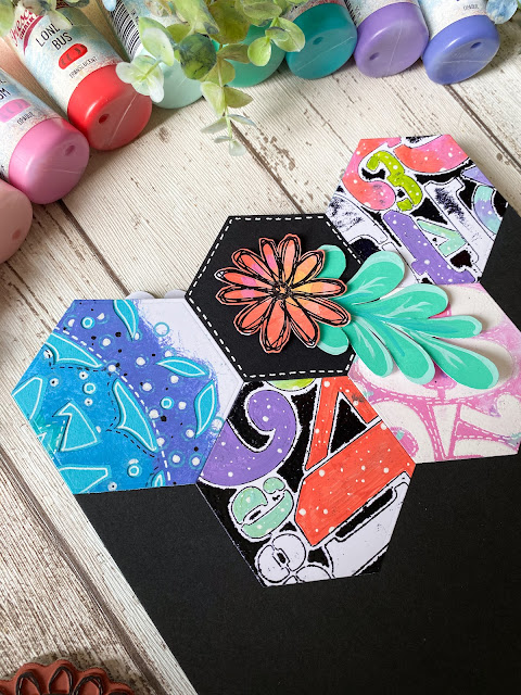
To begin, I needed to create enough surfaces to be able to create a tessellated pattern with. I wanted to use Tracy's Lace Booklet along with some stencilling too. The main stencil was PS208.
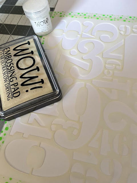
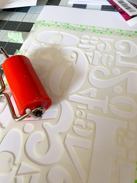
I began by creating a number of surfaces that I'd eventually cut out using a die. So I began with adding some embossing ink over the stencil and pressing carefully over every part.
Once you've done that- the stencil will be pretty caked in ink, so simply flip it over, grab your brayer (PaperArtsy do such a lovely small sized one here) and press firmly into the cardstock.
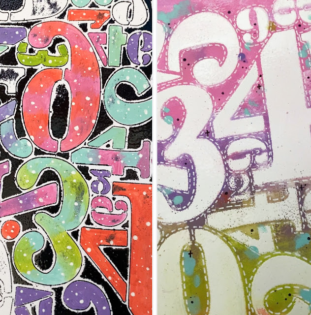
So two stencilled pieces for the price of one. Granted, one will be back to front, but if you're chopping them up anyway, it doesn't really matter. I added white embossing powder and heated to set for one and then to the back to front piece, I added black embossing powder and a variety of paint colours to each panel.
Truth be told, I didn't love these but decided to press on regardless, hoping that something would come good. I stuck to these Fresco Finish colours plus Berry Nice.
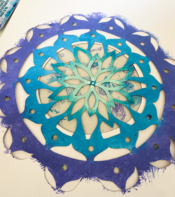
Next I moved to adding paint onto Tracy's Lace Booklet. If you've never used these before, they are laser cut shapes on folded quality cardstock. You can use them folded (they create interesting shapes looking through to the next layer, or simply cut the folded page into two so I could use them separately. If you're a scrapbooker, journaller or simply want to change up your arty habits, these lace booklets are pretty cool. I just dabbed paint on them and ended up being glad later that I'd left the outer edge an uneven mess!
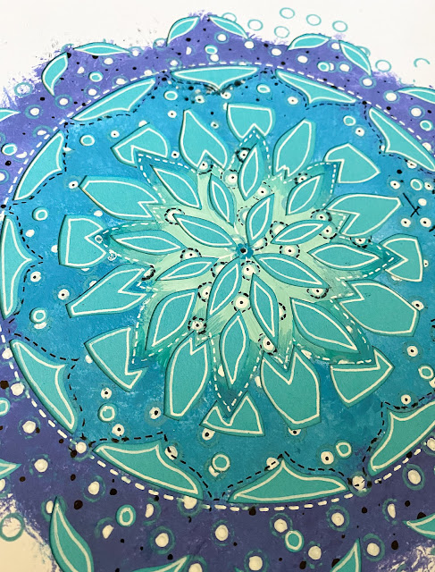
I now needed to create more colour and start adding little details to the 'lace' to add details and texture.
Give me a white gel and I'm perfectly happy. I love adding dashed, dotted or crossed elements. To get a little more interest, I also wanted to add a unifying repeating image and the TSM04 was perfect.
I wanted to use some similar colours to the ones on the stencilled panels to act as a contrast. All very relaxing.
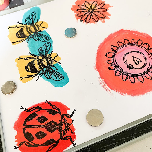
I also needed to prepare some of my focal images. Roughly sizing up your stamped image, estimating where the different colours needed to be, painting and then stamping over them is a quick way to get lots of bold colour without worrying about painting within the lines.
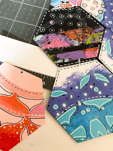
Now I'd got my main stamped, stencilled and painted sections- it was time for the chop! If you don't have a die-cutting machine, it really doesn't matter, simply download or draw a symmetrical shape and use as a template. I just die cut hexagons.
Now the project took a turn....for the worse!!
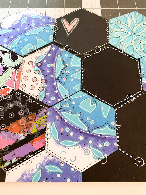
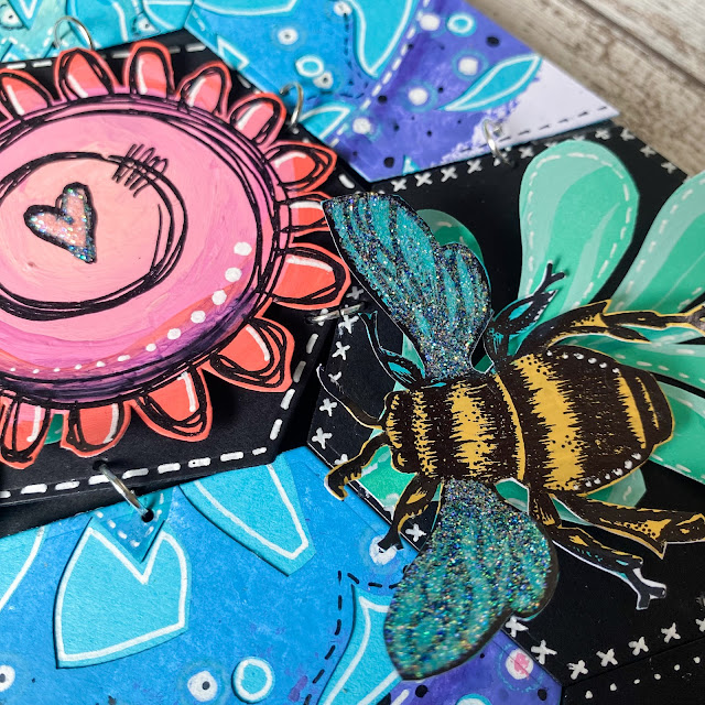
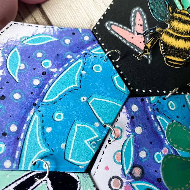
I used one of the leftover pinky hexies to act as a template to mark where I'd need to punch holes. I'd planned from the start to use jump rings and got a selection of different sizes. The larger ones fitted perfectly. It's a little fiddly, but I enjoyed linking them all together.
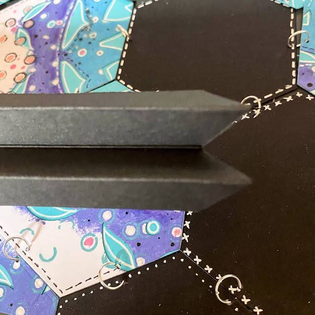
In order to make the bag, I wanted a gusseted side, so made an accordion fold from some more black cardstock and angled the ends so they'd butt up to each other when at 90 degrees to each other.
This next photo shows how I lined up the edges, attaching them using double sided tape. What I haven't shown, is that once I'd done that step, I slid in a smaller piece of cardstock to support the hexies, which were sagging a little in the middle. I only secured the tops and bottoms to allow for a little movement when you pick it up.
After creating a back and securing it to the front, it was time to pull the project together.
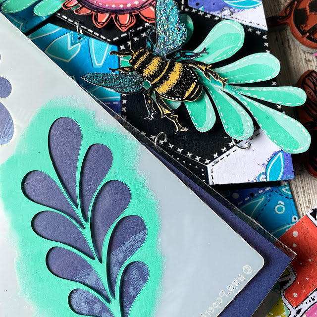
To add a little movement, I wanted some leaves, so used the PS388 stencil.
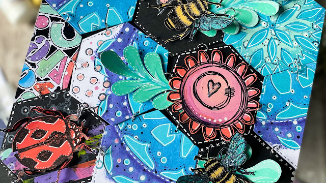
I added the extra focal points by adding using foam pads. I added a little glitter to wings and elements- because just a modicum of sparkle is always a good thing!
I trimmed the back piece small enough so that I could add some hexagons to the same height as the front panel and have a matching top. I had planned to add a handle (as it's a bag) but it looked too twee.
I loved the look of the jump rings, adding more texture and a little shine too.
Here's the finished piece!
I loved the evolving nature of the project. It was supposed to be a bag- although it's probably more useful as an envelope. I'd have to REALLY love someone to give them this as an envelope or bag! I did find the busy-ness of the final piece a little overwhelming as I'm normally more of a clean and simple vibe, but the richness of the colours and textures has won me over (or nearly ;-) ). Taking a simply painted piece and adding details such as small stamped images or doodled details with white or black pens (or choose your favourite colours) can give more interest than simply paint alone.
Do investigate Tracy Scott's Lace Booklets; so many ways to create with them. Try tessellating shapes; it's a great way of using up scraps of leftovers too!
Keren xx




.jpg)






envelope/bag, it's beautiful!
ReplyDeleteFabulous Creativity Keren and wonderful make .Great blog post. Loved reading all about you twists and turns. x
ReplyDelete