Hi everyone Keren Baker with you today,
I'm always up for a challenge and I've been loving creating structured art recently. When the Tetrads topic came up, loving colour as I do, I thought it might be fun to use Kay Carley's floral stamps to make a structured piece and just add in the colour challenge. It didn't quite turn out as I was expecting!
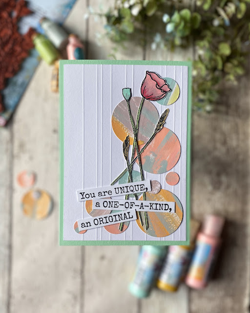
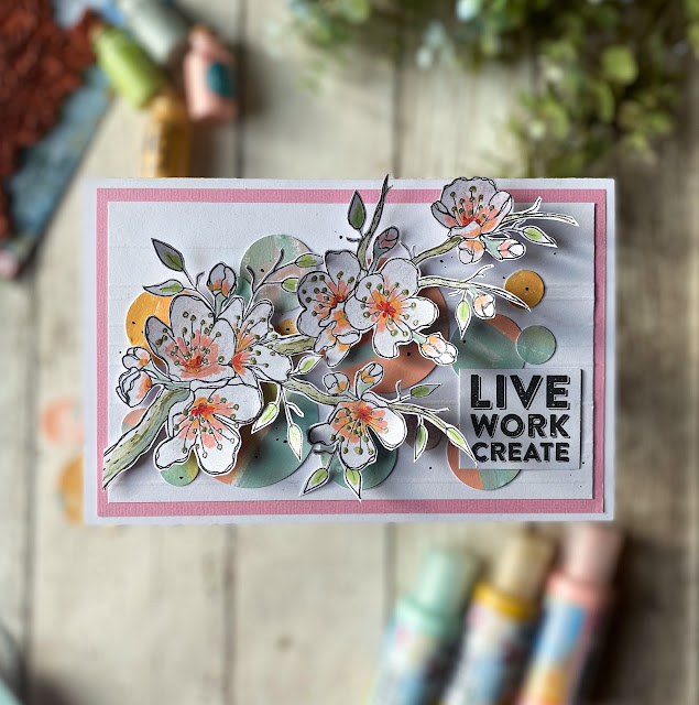
Here's the first finished piece. I ended up creating 4. To say it stretched me creatively is an understatement! At PaperArtsy, all the bloggers are also creating with the overall quarterly theme of 'Tracks' in mind. I love how the embossed parallel tracks are juxtaposed with the overlapping tracks of the stems. More about that later.
With this being a colour topic, I had chosen my terrific trio. Except it wasn't so much as terrific- it was terrifying! I'm a 'brights' girl and having chosen 'soft' colours was already worrying me. I got my supplies ready and thought if I at least created a colour wheel, perhaps inspiration would strike.
I also gathered a few 'backups'; I thought I might need to create shades and tints. Oh and adding a little brightness to add depth to my cards.
As the main point of this topic is the Tetradic scheme- I wanted to pick some slightly different colours to create my wheel; not going for a light red or pink, and picking a more peachy colour. The PaperArtsy Chalk Acrylic translucent Ochre colour is slightly brighter as I wanted to see how that would play with the subtler opaque colours of Peachy Keen and the bluey-green Aqua Duck Egg.
I painted up my wheel (for the downloadable colour wheels go here & if you've not done one before, go here for an illuminating how-to).
I was using the Tetradic 'square' scheme and to make it easier for me to decide (I'm more visual), I created this easy tool using just a die-cut square with some punched out circles at each corner, secured with a brad so it could rotate. You could easily create one for the rectangle and slim rectangle too. Here's the 3 versions and my final colour combo choice was number 3.
Truth be told, at this point I was NOT enjoying the process. But I'd painted all the leftover mixed paint onto a piece of PaperArtsy Smoothy cardstock (which turned out to be the saving 'spark' I needed) and then I was procrastinating hard. I knew I'd need a small stash of the correct colours for whatever I'd create so spent an 'undisclosed' ;-) amount of time making up the colours and transferring them into little glass bottles I had leftover from a previous PaperArtsy blog post.
Can you sense my avoidance of starting?! It was time to just stamp and paint and get going. I stamped, painted and ended up with lots of fussy cut images. It's well worth having a stamping platform around as with tiny/thinner images like these, you'll really benefit from being able to over-stamp them after painting.
This was where the 'eureka' moment came. The punches that I'd had out to make my tetrads 'viewer' were still on the table along with the leftover paint sheet. What if I just punched all the 'clean-up sheet' with different sized punches and used them to 'anchor' my stamped elements? I punched just a few circles (haha!).

Now I could feel my creativity starting to begin.
Most of the final creating was more compilation and deciding on designs than anything else. All the groundwork and supplies were ready, and this made for some speedy making which was a contrast to my super slow beginning.
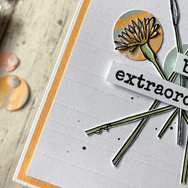
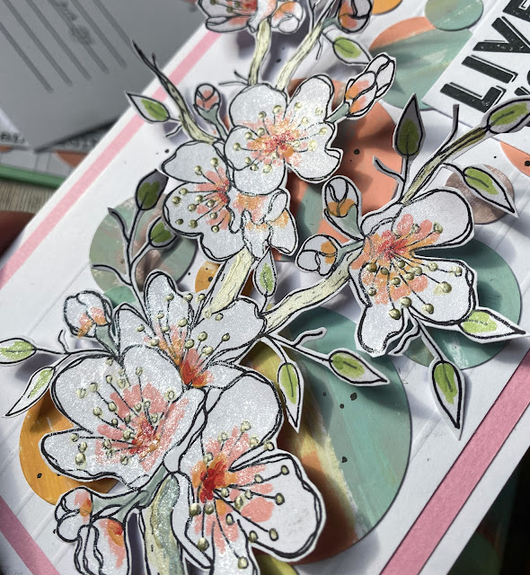
You can hopefully see on the first couple of the photos the embossing which I added to the main cardstock layer to give more texture to the white and fit the design in with the Tracks theme.
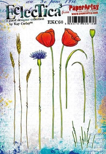
You can see the beautiful flowers from the Kay Carley stamp set EKC60.
The tracks (both parallel and crossing) reminded me of relationships I've had with friends; some where I've made amazing friendships after remarkable seemingly chance meetings ( tracks intersecting and crossing) and other people who you like and know but you never seem to deepen in relationship with and remain as parallel tracks; always a distance away but heading in the same direction!
The next project came from a desire to do a more relaxed design, rotating the 'tracks' and using a playful quote from a JoFY stamp set JOFY72.
The beauty of the circles is that not only do they provide interest, texture and movement to the design, they also tie the colour scheme together (adding hints of the other colours in the colour wheel) and most importantly 'ground' the stamped images so they're not 'floating' on the white space.
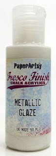
It's hard to capture, but hopefully you can get idea of the fabulous metallic shine that the glaze gives!
I love the exuberance of Kay's floral design and the life it brings to the piece. The sentiment was from one of the sets I've had for a while, Hot Picks stamp set HP1301. I looked at the leftovers on my table and thought I should be particularly thrifty!
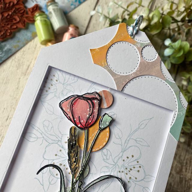
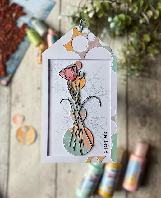
All the punched circles had obviously created waste, but instead of throwing them away, I liked the circular edges and decided upon creating a giant tag.
I love adding dots and dashes and these projects were no exception. You can see I stamped the background with a soft blue ink and used the floral Kay Carley stamp set EKC56 again. The circles are actually suspended on string and I love how it looks a little like a vase. The sentiment for this (& the first card) came from the JoFY stamp set JOFY73.
I learned to persevere with this set of projects. Truthfully, they're not really my style per se and for some reason the pastel tones seemed to hamper my efforts to make them more artsy rather than pretty. I also wish I'd added some stencilled elements for texture on the background.
I was quite pleased with myself for finishing- and loved using up all the bits which is something I'll definitely try and do more of, as it incorporated a fun unexpected element to the designs. Will I create with pastels again? Possibly, but I need a little break from the stress of it (only joking!).
These card projects are perfect for beginners and Kay's beautiful designs are very inspiring, and I'm itching to go all rainbow using them. How have you overcome design struggles and do you use leftovers to great effect? We'd love to hear about it!
Keren xx



Love the way you've used the circles to offset the flowers - really effective.
ReplyDeletePastels are not my usual colour palette either but they look fantastic here - particularly like the last piece - the flowers are beautiful.
I think you totally need to do pastels more Keren! Haha, not your go to, but so pretty!
ReplyDeleteGreat end result Keren and enjoyed reading about the process getting there, including the 'procrastination' as you were trying to get your head around how it was going to come together.
ReplyDeleteKeren, I really like this soft palette you came up with and those vials of leftover paint... sigh... so cute! I've always been drawn to these long skinny Kay Carley stamps and love how you combined them with the punched painty circles for a really unique modern style of card, so YOU! Sometimes we just have to be patient, keep going and trust the process. Well done friend! xx
ReplyDelete