Hi everyone, it's Jennie (Live the Dream) with you today, and I'm here to share with you a small book box using some fiery colours and a selection of stamps from the Ink and Dog Mini Stamps Collection.
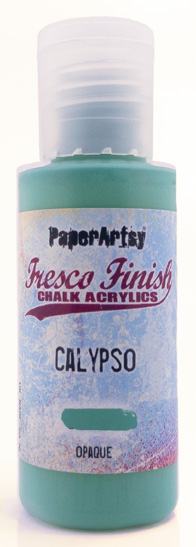
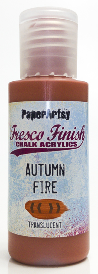
For those of you that know me I am very much a neutrals/pastels creator and so when I was asked to consider taking part in this Triad Challenge I wasn't too sure what I was letting myself in for! I spent ages looking at colour wheels and decided to choose my Triad from colours which were not main primary colours but a "step" away. This gave me the choice of a turquoise (Calypso) instead of blue, plum (Professor Plum) instead of red and an orange (Autumn Fire) for my yellow.
The resulting painted colour wheel was extremely interesting particularly the lilac in section 6 but the green in section 11 seemed very odd ! and in fact I mixed it twice to make sure it was correct. However, Autumn Fire is transluscent and I was mixing this with an opaque so the latter must have "won" the battle of the mix!
I decided that the colours had a real Moroccan Market feel and decided to experiment first with paints on my Gel Plate before deciding how to use them ..... the result was a small book/box which can be used for trinkets or other finds.
Whenever I want to experiment with colours I nearly always turn to the Gel Plate. I love the way colours can be combined but also the way not everything blends together well so there appears to be little spots of lighter/darker mixing and due to the waxiness of the plate the odd little bit of white shows through. This gives a feeling of "texture" without adding anything into the mix at all.
I did try some random mixing of colours which didn't quite have a "feel" to them but once I decided on landscape striped areas of colour the feeling of an early evening Marakesh market square came to life!
I turned next to the stamps and had already fallen in love with the pattern of MN122 which again had a Moroccan carpet feel to it. Random stamping with some matching Archival Ink along with the text of MN124 started to fill in some of the areas.
However .... I did turn to two favourite Ink and the Dog Mini Stamps which I tend to use in ALL my backgrounds. In fact MN72 never leaves the block and sits on the craft table all the time.
MN23 MN72
I didn't have any matching inks for the middle section but decided to go for a turquoise Archival ink which blended well with the Calypso but didn't look out of place on the Autumn Fire. As this was beginning to feel more like "sky" I used only the text and splatter stamps keeping a more open finish.


My main focus of my project had always been the beautiful new Mini Portrait stamp. I had instantly thought she was a "red head" so started by colouring with the hair and kept everything else quite simple.
She needed a frame ...... I tried different ideas from die cuts to wooden frames but then this little mask caught my eye and she fitted the aperture perfectly!
I new from the start that I would have to choose one of the three Triad colours as the main embellishment colour. As the frame would be located on the plum area of the paper I decided to go for the plum rather than adding in another distraction. I tried mixing Professor Plum Fresco with the Grunge Paste but it came out rather pink, so in the end used the Grunge Paste in its natural form on some thickish watercolour paper and once it had dried and was cut out, painted it with the Fresco Paint.

I used Eileen Hull's Skinny Mini Box Die to create the box as it is a good size for utilising an A4 sheet of gel plate print. I cut the paper in sections so it wrapped around the cover. However it would be easy enough to make a book cover in a similar way without the box.
I used one of my other prints to create a similar piece inside the box along with the quote from MN109.
This print was darker in colour and I felt worked better inside the box rather than outside. By this time the colours were really appealing to me and I was on a roll in terms of tying in other embellishments which focused on the Triad colours.... (I never thought I would feel so relaxed about bright colours!).
In keeping with the Moroccan feel I added some gold dry brush work on the frame. I felt the wooden embellishment worked better in the same colours as the frame but the little paper flowers painted in Autumn Fire Frescos added the contrast without being overpowering.
I experimented with other coloured embellishments but went for the contrast ribbon and hanging embellishment which felt more tonal ..... if you can say that with such bright colours!
Without the challenge of using the colour wheel I would not have put these three colours together or felt confident in creating with them. I cannot stress enough how "out" of my comfort zone this was, but being able to rely on a technical means of choosing the colours there was a reasonable acceptance that they should work together.
I am not sure that my random prints would have worked well but by isolating the colours into the three individual strips they combined better and gave me something which I felt I could identify with .... the Moroccan Market by night.
I shall certainly try this again in order to move myself away from my usual colours. It was exciting, terrifying, creative and satisfying all at the same time! I hope you give it a try!
Jennie x


Wow - never thought I'd need to bring my shades to a Jennie Atkinson post... and it just goes to show you can turn your hand to any colour combination, Jennie, and make it beautiful. Amazing!
ReplyDeleteAlison x