2020 Topic 18: Geometric
Hi everyone, it's Keren with you today, and I'd like to share with you a project trying to add a little geometric style into a Lynne Perrella stamp or two. I chose Lynne's stamps as they are real favourites of mine but I hadn't really planned how the topic would fit into the style of stamps. After a bit of brain fog, I decided to add an opaque layer that still showed the image, but allowed me to do a little doodling.
One of my favourite substrates (after acetate) is Duralar Matte film. I love the way you can add alcohol markers, pencils, gel pen and other markers onto it.
Initially I just stamped the main image from LPC030 onto some Heavyweight Smoothy.
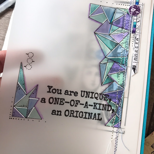
I trimmed out a piece of Matte film and secured it over the stamped image. I had chosen this image because of the grid - making it look more geometric than some of the other images in her stamp collection. Whilst looking at it through the overlaid film, I thought that by using the dots on the grid I could create a series of geometric shapes (mostly triangular.) I used a fine marker by Copic that I knew would dry well on the film.
Using alcohol markers, I coloured the reverse of the film. You need to use darker colours for the colours to show, but I didn't want to use too dark a colour, as I wanted to be able to see glimpses of the beautiful image showing through. The triangular shapes seemed flat, so I added highlights with a white gel pen (that surprisingly dried perfectly) and some doodled dots. It still needed extra so I added some shadow using Prismacolors.
For this project I was trying to get over my aversion to purple! I don't think I'm quite there yet but the blues and aquas helped! It definitely needed a sentiment so I added in one from JOFY72.
To keep the film and cardstock together, I sewed 3 lines of stitching in blue, purple and white.
I coloured in small sections of the stamped image with Prismacolor pencils and added a few stamped circles from LPC024.
There were just some little details to add; using the stacked squares on the image and a little strip of the main image. A simple enough card that was very therapeutic to create.
Although this ended up as a card, I wish I'd been more ambitious in planning a more complex project. I'll have to find someone 'worthy' (haha!) to send this to. Maybe I'll cut the back off the card and create a journal cover with it instead.
I hope you get the chance to have a doodle or sketch today, it's a wonderful panacea for the stresses of the day and the climate we find ourselves in.


this looks beautiful! just like stained glass; I love it.
ReplyDeleteThis is wonderful Keren. I love the effect you've created.
ReplyDeleteIngenious and beautiful project Keren!! I love it. xx
ReplyDeleteWhat an inspired way to add geometric detailing over one of Lynne's detailed designs Keren. Loving the layering elements and your choice of colours x
ReplyDeleteYou come up with the best ideas!!
ReplyDelete