2020 Topic 17: Day And Night
Artistic processes rarely run entirely to plan, and Helen's Circle Of Life project incorporates experimentation, patience and a whole lot of doodling. She's ended up with a beautiful representation of both this topic and indeed of life itself.
~ Keren.
~ Keren.
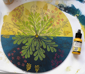
Hi everyone, it's Helen with you today, and I'd like to share with you project which I've called the Circle of Life - for obvious reasons! I wanted to create a clear demarcation between Day and Night but still give the idea that it goes round and round. I've deliberately used the same colours against both the yellow and the dark blue to see how the background colour affects the colour on top, just as the light of day and darkness of night would. The stamping is roughly symmetrical.


The MDF circle was originally, I think, part of a clock blank - hence the hole in the middle. I used washi tape to divide it off and then painted each half with Frescos: Snowflake, Zesty Zing, Banana, Midnight and Deep Sea.
Then I added a bit of stencilling in Slimed; it's interesting how the green looks so different on the dark background.
I've stamped in black trying to keep the flowers in roughly the same place on each side.
As so many of the flowers were dotty I decided to used Ranger Enamel Accents to add a bit of gloss.
Then I filled in the open flowers with Frescos.
I used Posca pens to add extra colour and doodling. You could also do this with Frescos and a fine brush but I always end up wobbling at the wrong moment!
I was a bit worried that the background stencilling was too strong so I added shading with a soft pencil and white highlights. I also drew the stamped lines back in with a fine black pen.
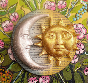
For the centre ATCoin I've made a sun and a moon using a Prima mould and layered them onto a scrap of inked, patterned paper. You can hide a brad under the sun so the ATCoin turns.
I like how this project turned out - eventually! This was my third attempt.
I knew what I wanted to do but couldn't get it quite right. I started off by blending the night and day colours at the sides to create dawn and dusk, but that took up too much space. Then I tried it without the stencilling, but that looked too flat - I felt like Goldilocks! Then I spent ages trying to work out what to put in the middle to hide all the mess where the stalks overlapped. An ATCoin was just the right size. As they say, third time lucky! I think by then I just decided to go for it.
Day and Night is a great topic with so many different interpretations. It'll be great to see what you come up with.
Helen
Blog: A Splash of Colour


This is fabulous Helen. It really was worth how long it took to get it how you wanted. Love it!
ReplyDeleteThis is magnificent Helen the way you've added back the detailing to the stamped flowers over that clever daytime/night time background is so effective x
ReplyDelete