Showing posts with label Alcohol inks. Show all posts

Monday, 16 September 2024

2024 Topic 7: (Gel) Printing {by Kate Crane} on the PaperArtsy Blog


Hi everyone, Kate Crane here with you today.

I've been busy gel plate printing lately, although to be fair I do a lot of gel plate printing all the time!  I looked through my stamp collection and picked out the closest thing to nature! Fishies chasing each other, and of course the humble tree. 

When I'm printing I like to print quite a few backgrounds for a couple of reasons. Firstly it can be a bit messy so you might as well do a few while you're on, and secondly I like a few colour combinations to choose from. It stops me from overthinking about what goes with what. If you have a few prints you can just grab and go, and sometimes find yourself creating something a bit different, something that you would have never have thought of.

I created a few backgrounds on my gel plate using a combination of alcohol inks and Frescos along with stencils. I love the serendipity of printing; you just don't know what you are going to get and you never get the same result twice!

In my projects today I'm going to build up layered backgrounds, playing with colour combinations, and then add some fun bouncing hanging stamped images, coloured with Mattints.


Frescos: Cerulean, Aqua Duck Egg, Snowflake, Dirty Lime
Stencils: PS442, PS441, PS428

When I added my colours to the gel plate I was quite careful about the colours I put together to avoid making mud. If you choose colours from the same colour family, or cool or warm colour combinations a you can avoid making murky prints. Opposites on the colour wheel will make brown (so blue and orange for example) - a good tip to remember.


I began my print-making session with alcohol inks and Frescos. Alcohol inks dry fast, so once dry on the gel plate you need a layer of acrylic paint to pick up your print. In the past I have used alcohol inks on my gel plate with stencils a lot, but this time I did it a little differently.

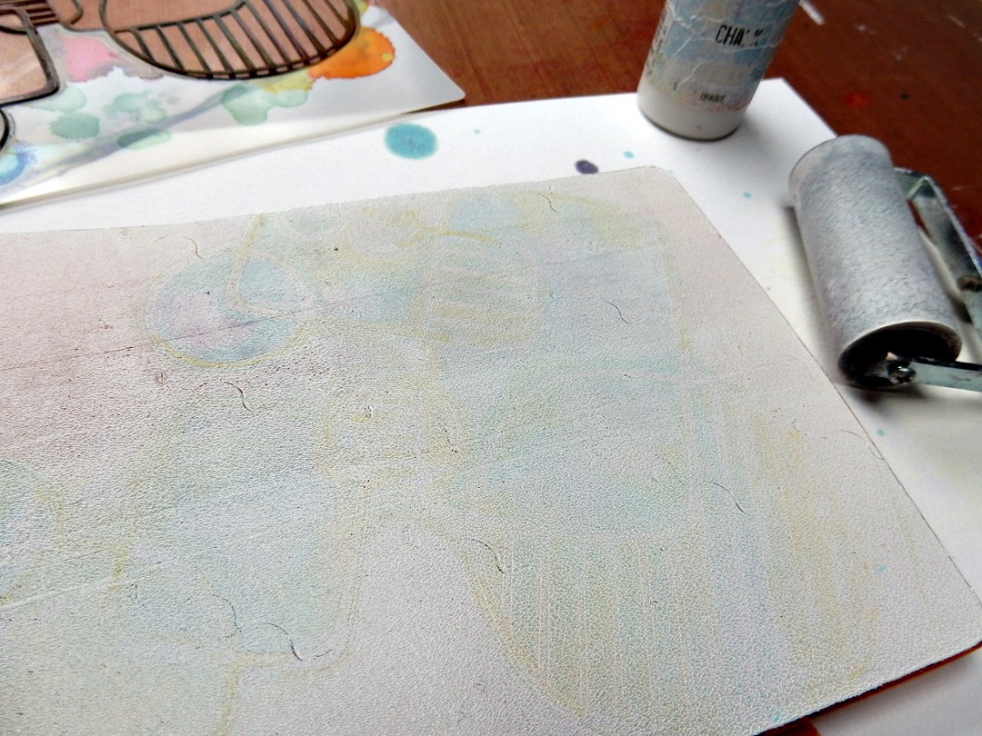
I began by splashing alcohol ink on the gel plate along with a little blending solution which dilutes the colours a little for a more pastel result. I then put a protective glove on and spread the ink a little on the plate with my hands. While it was wet I laid the stencil over this and the ink immediately flooded under the stencil creating a pattern. I then just rolled kitchen roll over the top to remove some of the ink and then let it dry for a short while (remember alcohol dries fast!). Finally I lifted the stencil and simply brayed a thin layer of Snowflake Fresco over and took a print while the Snowflake paint was still wet. 

I repeated this a few times using different colour combinations. 


I then tried something else a little different. I placed my stencil directly on the plate and brayered a thick layer of Snowflake Fresco paint. I lifted the stencil, let it dry, and then built up several light layers of blues and greens with a brayer, letting it dry in-between. This creates a nice grungy look! Once the layers have dried a final layer of white allows you to lift the pattern.


I'm really happy with the various colours and patterns I have created here, and this gives me plenty of choice for building my backgrounds. Sometimes prints can look messy and untidy when you first do them but once you trim them and start using them they take on a whole new life.
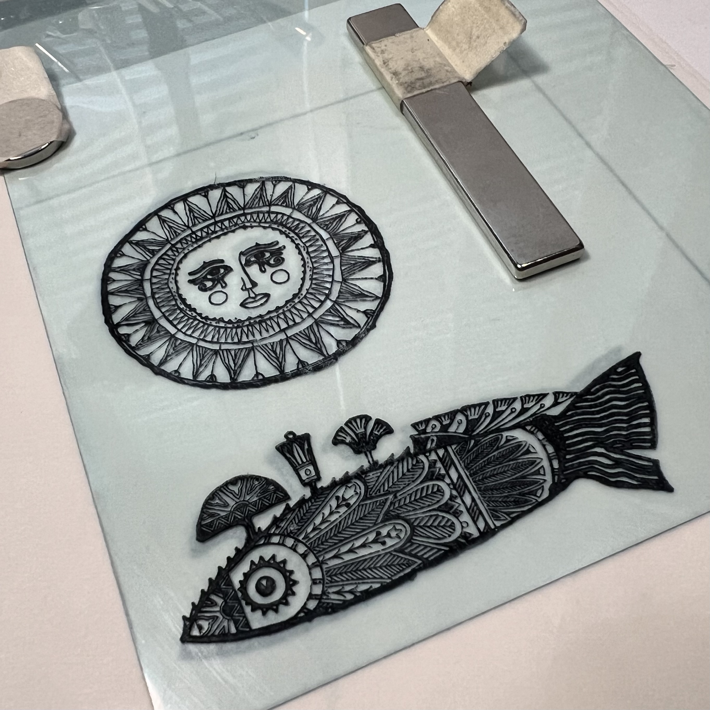

Stamp: KC003

Next, I needed some coloured images for my little projects. I stamped, and then coloured with Mattints. I find Mattints are perfect for adding colour to your stamped images. They blend easily and you can build up the layers to create strong colour.

Backgrounds next! I chose to layer several prints over each other each time getting a little smaller. Here I am working on two little projects at the same time. This is when it is so useful to have a few prints to play with, you can experiment easily with different colour combinations.

Stamp KC008


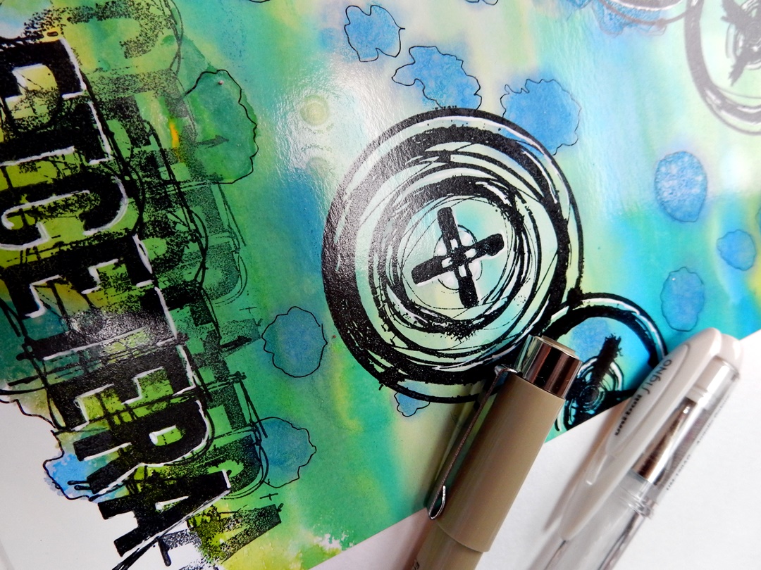
Before I start gluing things down, these backgrounds and images need a little more work. I like to add depth to my stamped images with a Stabilo All pencil. The stamped images have micro dots for shaded areas so this a good guide for where to add the Stabilo shading. You can go really quite dark in these corners, it helps your images to pop! And then of course, a white Posca paint pen is great for adding highlights.


But Poscas aren't just for images, they are great for adding nice scribbles to your background too. I let the pattern created by the stencil guide me for this.


Once you glue or tape your background layers together, a bit of texture stamping over the top of everything looks great especially if you use corresponding colours and just a touch of black.

Stamps: KCM001, KCM002

In something like this, stitching is completely optional as it is purely decorative and not functional, although it is an alternative to wet glue! I love the look of stitching though, so I just use a regular sewing machine with a regular needle and add stitch away!


My very final background layers are always a touch of Stickles Glitter for a bit of sparkle, and a touch of metallic paint, usually by junk-stamping with loads and old cards or lids. These final touches do help to bring the layers together.


To add my floating-bouncy hanging images I used Grafix DurLar clear film, simply cut into narrow strips and glued to the reverse of my background panel.


If you missed any of my recent tutorials in the PaperArtsy People Facebook group, head over there to the guides section, and under the Kate Crane Guide you will find the following...

Thursday, 11 July 2024

2024 Topic 5: Ink Pads {by Ann Barnes} on the PaperArtsy Blog


Hi everyone, Ann (aksbarchitect CREATES) here with you today.

I've been keeping busy with my family lately. My youngest just finished high school and will be heading off to college at the end of summer. Along with celebrating her achievements, we have been preparing for the next step and savoring the summer days before she leaves. 

When I heard that inks/ink pads would be the fifth topic for the PaperArtsy blog, I immediately thought of working with alcohol inks and the Alcohol Lift Ink Pad. I love the vibrant colors of alcohol inks and there are so many techniques to play around with. I am also wondering if perhaps my desire to work with the alcohol ink might have something to do with the fact that it is sometimes not easily controlled, you simply need to embrace the beauty of the flow... kind of like having your youngest leave the nest.


For me, Lynne Perrella stamps and bright and bold colors go hand in hand. I have a floating glass frame that I've been holding onto for a while and I think it would make a wonderful sun catcher to hang in a bright spot. I want to combine the beautiful PaperArtsy Lynne Perrella Collection stamps (LPC040) with alcohol ink. I imagine it will be stunning as the sun shines through it during these long summer days. I look forward to sharing some of my experimental play with the alcohol inks during the creation of the piece. I am really pleased with how the piece turned out, giving off a wonderful summer vibe. I already have ideas for creating inserts for different seasons. 

One of my favorite aspects of the piece is how I incorporated the "hidden" theme into the design. 
Using alcohol lift ink, I was able to create a ghosted stamp design in the background. This adds a bit of interest without taking over the focus. I can't wait to share the process with you.


Knowing I was creating something to enjoy this summer, I chose bright vivid colors, opting for yellow, blue, teal, orange, purple and magenta, but I believe that any colors you my have would work splendidly. The Lynne Perrella Collection stamp set 40 (LPC040) has a beautiful detailed sun image that I thought would be wonderful as a focal point. Being in the summer mindset meant that I also would use the fish stamp from the same set.


Knowing the size of the frame I will be using allows me to select different stamp designs that may fit best. You can always use portions of a stamp to fit an area if the overall dimensions don't work out. When I chose the sun stamp, I wanted a blue/teal "sky" color for the background and Tim Holtz Alcohol Ink (Stream) was perfect.


The best alcohol ink results are achieved on a non-porous substrate. For this project, I used Grafics clear Dura-Lar as my base. There are a number of ways to apply ink to the surface, and varying opinions on each. It's always best to try different techniques and decide what works best for you. You can find a bunch of videos on YouTube to help you get started if you have never worked with alcohol inks before. (I really enjoy watching Tim Holtz demo alcohol inks!) I like to create a solid background by using a paint brush with the ink. You can use either alcohol ink blending solution or isopropyl alcohol as your fluid medium. If using alcohol, be sure to always use at least 91% (or higher) alcohol.


When the backgrounds are dry, I will incorporate my "hidden" feature. To do this, I use an alcohol lift ink pad and a stamp. Always be sure to clean the stamp prior to using it with lift ink. Also note that the more vibrant and more heavily inked the base, the better the "lifted" image. A high contrast allows the details to show clearly.

Now to the magic of the alcohol lift ink...

Using the Alcohol Lift Ink pad (by Ranger industries), ink the stamp then stamp onto the background making sure to put even pressure along the entire image. Then, carefully lift the stamp off the background and set aside. Using a clean cloth (or a smooth paper towel) blot the stamped design, constantly turning the towel to a clean area before blotting another section. Essentially what we are doing is removing the lift ink. In order to keep the image crisp, it is important that you do not rub the area and smudge the ink, you want to simply blot and lift the towel then repeat the procedure with a clean area of the towel until all traces of the lift ink are removed and you can see a negative of the image. So instead of seeing a stamped image on the background, you will have the background with the image removed from it.


Once you have completed the blotting process, you can attend to the stamp that is now "inked" with lift ink and the alcohol ink that it removed. This can be stamped onto another substrate. I prefer to stamp this onto Ranger Industries - alcohol ink cardstock. The coating on this paper accepts the alcohol ink beautifully. Once you have stamped the image, wipe off the stamp and start again. It is important that you wipe your stamp clean each time before inking it with the alcohol lift ink.


I created a pattern on the background by repeatedly stamping and blotting the fish image from Lynne Perrella Collection 040 (
LPC040). I love the detailing that is visible upon close inspection.


I had originally envisioned a richly colored background, but had a difficult time getting a smooth, non streaky base layer of alcohol ink, so I ended up using the lighter colored background. Initially I was disappointed; however, once the pattern emerged, I was glad that it played more into the quarterly "hidden" theme. This will give me more opportunity to showcase the focal images with vibrant colors. Having my background established, it was now time to focus on my favorite way to use alcohol inks, painting with them. For me, the easiest way to do this is using a palette of alcohol ink that is essentially dry in wells (or pans). The palette I use is byTim Holtz and contains 36 compartments for different colors.


Using Ranger Archival Ink and a stamping platform, I stamped the images onto the Dur a Lar and allowed it to dry completely. Since the alcohol ink will smear the archival ink, and my base is clear, I will be "painting" the reverse side. I add color to reverse side of each of the images and allow it to dry. If you are not happy with something, alcohol ink is easily removed by using a brush loaded with alcohol and taking up the unwanted ink, then wiping the brush on a paper towel. You can then go back in and re-paint the area.


Painting with the alcohol ink takes a bit of practice and a lot of acceptance. Although you can somewhat control the ink, it still sometimes has a mind of its own. Depending on how wet your brush is when you load it will make all the difference as to how much it bleeds once it is brushed onto the substrate. It's a great idea to keep a paper towel beside the palette to absorb some of the alcohol before picking up the color.


I like to keep two small jars of 91% alcohol handy when I am painting with alcohol ink. The first I  try to keep as clean as possible, to use as a fluid medium for painting. The other jar is used to clean my brush between colors. Similar to using watercolor paints, if you mix the pigment with muddy liquid it will affect the color when you got to paint with it. The clearer the alcohol you are mixing with, the truer the ink color will be when you are painting with it.


Once you are satisfied with your painting, allow it to dry. This won't take long, alcohol ink dries very quickly. 


I changed out the original chain that the frame was supposed to hang from with a wire and some trade beads that I had from my stash. Then I trimmed the piece to fit into my frame and voila! I already have ideas for creating different pieces to use in the frame. the PaperArtsy Lynne Perrella Collection has so many beautiful designs, maybe I won't just limit myself to seasons...

Thursday, 15 December 2022

2022 Topic 16 : Splosh {by Liesbeth Fidder-de Vos} with Seth Apter stamps


Hi everyone, it's Liesbeth with you today, and I'm here to share with you my abstract, sploshy, glossy cards using a selection of stamps designed by Seth Apter! 


With Seth´s beautiful stamp sets and the topic Splosh as a starting point in mind, I immediately thought about the contrast between the sturdy stamps (black ink) and very glossy paper. And to drip, trickle, drop and dribble using colourful alcohol inks, a perfect combination!


Doing these kind of techniques I can totally lose myself and make backgrounds for hours and hours, not able to stop, so wonderful and surprising to do! I just do and experiment, so at the end I have a big stack of beautiful coloured backgrounds. For these cards I picked out some nice parts and saved the rest for another use. I use lots of alcohol inks...please don't ask me what colours I used for a specific card... I really don't know. For these background techniques you need lights and brights; not too dark. The paper I use is Chromolux, 300 gr. Size A4. I also use blending solution and some golden transfer foil.


And of course this  wonderful PaperArtsy stamps! ESA29 and ESA30. I see so many possibilities with these stamps! I see circles, swirls, fences, an antenna, crosses, targets, plinths and I even see grass, bushes and paths. And of course, those amazing words and texts. Love them!


Now lets start with the backgrounds and splashing. The first technique is the one I do most. You need to work quickly; the inks and blending solution dissipate quick. That's the reason it was a little difficult to shoot good pictures!
Drip several colours of alcohol ink in a nice mix of light and bright colours onto a craftsheet.


Drop some blending solution as well, not too little, as shown here.


Put your glossy paper in right away and press and move & turn it a bit. Lift the paper off the surface again... magic!


For a 'bokeh' effect: take the bottle of blending solution in your hand and through and splash some drops on the coloured paper.


Another technique: spread a large amount of blending solution on the paper using a blending tool and felt.


Drop different colours of alcohol ink, it will flow much more now. Interchange every now and then with blending solution till the paper is almost full or until you are satisfied.


When the ink and blending solution is almost dry it's nice to add some gold transfer foil on edges that are still a little wet.


The third technique is this: Hold the paper (here I used a smaller piece: A6) upright and drop the ink at the top and let it weep and flow downwards. Sometimes some blending solution is needed here.


Doing this technique, sometimes a landscape appears! So I made a sun with orange ink, a piece of felt and a circle stencil.


And the fourth technique: 
The same vertical dropping, but in this case first spray the entire paper with blending solution. I put some in a mini-mister. Then quickly throw and slash some alcohol inks from a bigger distance (20-30 cm) and magic will happen. After drying it's great to spray a bit of blending solution again. Make sure you ventilate your room well and don't do this for too long.


And now the good old marbling technique: put some drops of alcohol inks and a droplet of blending solution onto the blending felt and start pounding. twist the blending tool a little after each time to change position.


Sometimes you need some new/more ink or blending solution. This needs some patience, keep going until you are satisfied.


Here I did some extras onto the marbled paper: I used PaperArtsy stencil PS040 (Kim Dellow), put it on the paper and added some more alcohol ink using the felt tool.


This is the result, I love it! Stained glass!


And now a bonus technique using the same stencil, a bit different. Roll out some light alcohol ink onto a gelli plate with a brayer.


Put the stencil on the gelli plate, the ink works as a glue. Now start dropping again, lots of colours of alcohol ink until you don't see the gelli plate anymore.


Leave the stencil on, let it dry for a long time, overnight for example.


If dry, add a thin layer of PaperArtsy Fresco Finish Paint: Chalk onto the surface, take a piece of (normal, not glossy) paper and press in down firmly using your hands or the brayer.


Peel off the paper carefully and...magic again!


Here is the result of not being able to stop...a pile of wonderful coloured papers. Of course, it's also great to mix and combine the different techniques and there are so many more nice techniques. Now it's time to cut out some beautiful pieces and stamp!


I have chosen some nice parts from the papers and cut out different sizes. Using Tsukineko StazOn ink - Jet Black.


Stamping with the wonderful Seth Apter stamps, they are so perfect for this abstract cards. I stamped 'Etcetera' three times to create a shadow. The card is a Slimline (21 x 10 cm).


After stamping I drew some details with a white gel pen and a black fine-liner.


Here I coloured only half the card and left some white.


The landscape background. Here I masked pars of it and stamped a fence and some bushes. ;-)


I also drew grasses and plants and even a road and houses (See the finished card below).


Like I almost always do I finished the cards with some glitter glue (Stickles Diamond).


Some finished cards, matted on two colours of cardstock.


And here are the results: nine glossy abstract cards. First the gelli printed one: for the stamps I chose the same shape, fitting in the shape of the stencil. After that I masked the card here and there to stamp the numbers.


Two slimline cards.


'Stained glass' made with the stencil...this background needed just this beautiful sentiment! I outlined the stencil print with a black fine-liner.


A peaceful landscape. I used the big cross stamp laying at the bottom as bushes. Some white spots in the background became houses.


The other finished cards with the different and mixed splosh techniques.


A detail...


Splashing and dripping with alcohol inks is one of my favourite things to do! Especially in combination with that very glossy paper; always a wonderful effect. Beforehand you never know what's going to happen..so much fun! There's only one problem...the pictures. The photos are never as beautiful as the real pieces. It's so hard to catch the shine, the deep colours. So, there's an extra reason for you to give it a try yourself and see the magic with your own eyes! Enjoy!

Liesbeth XX