

Hi friends, It's Katy Norgate with you for another 'With 3 Things' challenge post.
For this feature on the PaperArtsy Blog 3 identical items are sent to 3 members of the PaperArtsy Blogging team. Typically we will receive a stamp, a stencil and a couple of Fresco Paints.
We have no clue what PaperArtsy HQ is going to send, the whole idea of this challenge is to do something crafty in our personal style with these 3 items. We can incorporate other PA products into the mix if we feel it is necessary.
So let's take a look at what I received from PA HQ ... And oh my, spring has bounced right out of the box with one of Kate Crane's very first stamp sets and stencil!! Lucky me!!
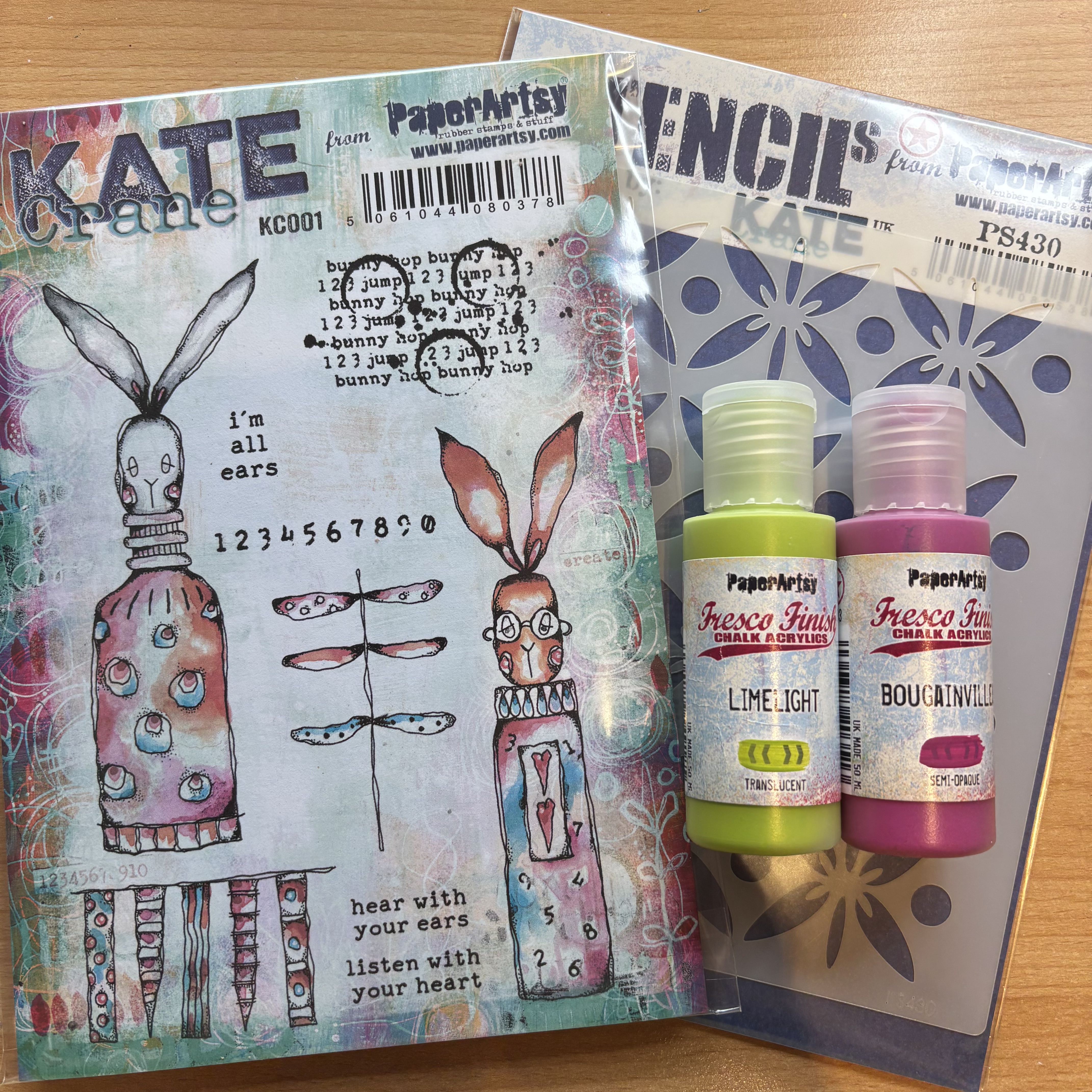
So let's take a look at what we have here: Kate Crane stamp set KC001; her stencil PS430 (See PaperArtsy stockists for these); along with two fresco finish chalk acrylics: bougainvillea and limelight. I was delighted to see this combination, right up my street, so to speak. I decided to create a journal page. Here are some images of my finished page ....

Lets take a closer look .....


So let me show you how I made this layered journal page. I tried to carefully stick to just the items sent ... though you will see as we progress, that I did add a few more goodies.
I chose to work in my 8 inch square black page journal. I started by adding a layer of white gesso, so that when I added the fresco finish chalk acrylic paints provided, bougainvillea and limelight, the colours would be true and pop. I used the end of my brush handle to make some scribbly texture.


While that was drying, I decided to play with the two paints to see what colour palette i could get, allowing myself only the addition of black and/or white to vary the tone and opacity. Even with a quick play, I was able to really stretch the palette to mauves, olive greens and peachy skin tones (one to remember). I think the yellow-green of limelight is clearly quite a versatile hue, when it comes to colour mixing.


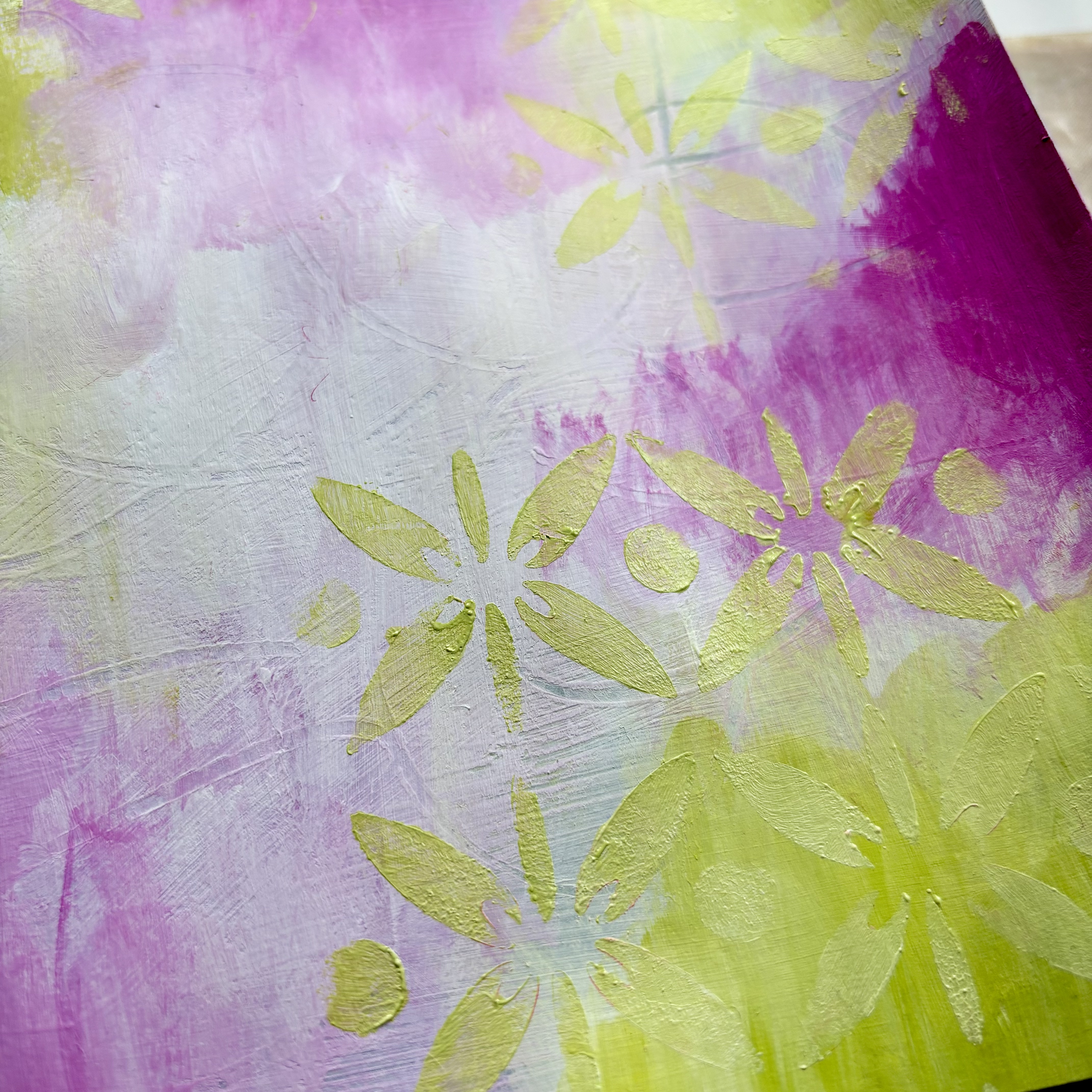
Here is a close up of the swatches.
Now to add colour to the page. You will see that despite these colour swatches, I decided to stick as much as possible, to the true colours. Allowing each layer of paint to dry before adding the next, I added Fresco finish chalk acrylic snowflake to keep the first layers pale, then I could add more depth of colour to the top layers. I applied these layers in a rather scruffy fashion, though as the page progresses you won't see this. Here are images of these first layers.


Now for some stencilling, to help blend these colours together. Kate's stencil (PS430) is such a lovely floral design and therefore great to play with in developing my spring floral theme. It brings the page together, but doesn't cover up too much of the under layers. As you can see from these images below, I used the limelight first, using a sponge to apply the paint through the stencil. Because limelight is a translucent paint, I wasn't getting the boldness of colour I was after, so mixed it with a small amount of the snowflake to make it more opaque.

I then added bougainvillea, and finally snowflake to knock back the colours a bit.


Can you see how this stencilling hides some of my untidy under painting?
I decided to let this page dry and get on making some of my collage items .... the pink flowers!
As I was stencilling the page, I could envision the potential to create dimensional flowers. So time to get the gel press out. Laying the stencil onto the 'clean' gel plate, I used a couple of shades of pink alcohol markers to apply the ink through the stencil. The markers create clear images, without making a mess, and dry quickly. Once applied, I then removed the stencil, and applied 2 shades of green to the centre of the images, as shown below.


Next is to stamp, fussy cut and colour the other collage images. I used mattints to colour the stamped images ...... The pink, Ash and Mojito, (see PaperArtsy stockists) and coloured pencils to add shading.


Now to build the final layers. I gathered some oddments of old book paper, stamped with black ink using stamps from Kate's set of texture stamps KC005, coloured Dura-lar film and an old gel print image, made with infusions and one of Kate's mini stencils PM034. See PaperArtsy stockists for both these products.

I used archival inks to apply texture stamping to the page, using tone on tone colours, as well as some black.


I glued everything in place, and decided to staple the flower pieces together for a more grungy effect. A final touch of glitter glue to the bunting and Mr Rabbit's ears, as well as some dimensional gel to the flowers, and hearts on Rabbits tummy, and I'm calling the page done!!


I hope you give this a go, it was good fun to create, getting messy in a journal gives you the freedom to experiment and play. I think the pink and green shades of bougainvillea and limelight work so well together in giving a colourful springtime vibe, as well as making some fabulous colour swatches. It was fun to challenge myself to stick ....as much as possible .... to working with the 3 things supplied by PaperArtsy.
Thank you for tuning in, until next time, have lots of creative fun.
Katy Norgate
Facebook: Katy Norgate
Instagram: katy_norgate
Pinterest: Katy Norgate
Really enjoyed seeing and reading how your journo page developed, Katy . Fabulous result :) x
ReplyDeleteThank you so much for visiting. So pleased you like it 🙂
DeleteStunning work Katy. Beautiful and bright and so many yummy layers. Mixing and swatching the paints - genius! Bravo!
ReplyDeleteThank you Kate, great designs to play with a springtime vibe x
DeleteWonderful composition 💕
ReplyDeleteThank you x
Delete