Bonjour everyone, it is Mi Mii (@themy32) with you today for another 'with 3 things' project.
This feature on the PaperArtsy Blog is where 3 bloggers are sent 3 items in the post. We have no clue what PaperArtsy HQ is going to send us, there might be a slight variation but generally 2 of the 3 things will be identical.
Bonjour à tous, c'est Mi Mii (@themy32 ) ici avec vous pour un autre projet 'With 3 Things'
Ce concept sur le blog PaperArtsy permet à 3 blogueurs de recevoir 3 articles mystères. Nous n'avons aucune idée de ce que PaperArtsy va nous envoyer, il peut y avoir une légère variation (par exemple, sur ce tour, nous avons chacun reçu des tampons différents) mais généralement 2 des 3 articles seront identiques.

There is always a touch of excitement when opening the mystery package! This time, I was sent this pretty stamp set by Sara Naumann (ESN23), with a grungy checker stencil, also by Sara Nauman (PS092) and two Fresco Finish paints in soft colours: Candy Floss (FF70), a tender opaque pink, and Tango (FF72), a translucent peppy orange.
Thinking mode engaged... let's go! Here is what I came up with, let's take a closer look:
Toujours une pointe d'excitation à l'ouverture et la découverte de ce que contient le colis surprise ! Cette fois-ci, on m'a envoyé ce joli set de tampons de Sara Naumann (ESN23) et un stencil damier grunge, toujours de Sara Naumann (PS092), ainsi que 2 peintures Paperartsy Fresco Finish aux couleurs douces, la Candy Floss (FF70), un joli rose tendre et opaque et la Tango (FF72), un orange translucide, qui forment à elles 2 un parfait combo couleur. Mode réflexion et cogitation enclenché !! Allez c'est parti !
Voici ce que je vous propose avec ces 3 produits ..... regardons ça plus en détail !
In addition to 'the 3 things' I used some PaperArtsy Grunge Paste (GP190), a water spray, and a black StazOn ink pad. My substrates are a bit unusual: a few old empty thread spools, some long scraps of white cotton fabric, wooden skewers and mini safety pins! I also needed some stuffing for the little hearts, a bit of glue and my sewing machine...
En plus du matériel qui m'a été envoyé, j'ai utilisé la PaperArtsy Grunge Paste (GP190), un spray d'eau, et un pad d'encre StazOn noire. Mes bases sont un peu originals: d'anciennes bobines de fils vides, des bandes de tissus cotons blanc, des piques à brochette et des minis épingles à nourrice! J'ai aussi eu besoin de coton pour rembourrer mes petits cœurs, de colle et de ma machine à coudre...
I started by braying roughly my Candy Floss (FF70) and Tango (FF72) paints on the fabric (I made the fabric a bit damp with misted water first so that the paint seeped in more easily).
J'ai commencé par colorer mon tissu, en étalant grossièrement au rouleau les peintures PaperArtsy Candy Floss (FF70) et Tango (FF72) (J'ai préalablement mouillé mon tissu afin que la peinture pénètre plus facilement).

Once the fabric was thoroughly dry, I then stamped the different hearts from the Sara Nauman stamp set (ESN23). To make the stuffed hearts, you need 2 mirrored copies of each, to have one on both side when the fabric is folded in half.
J'ai ensuite tamponné les différents motifs "cœur" de la planche de tampons PaperArtsy de Sara Naumann (ESN23). Afin de fabriquer les cœurs rembourrés qui ornent la bobine, il faut 2 exemplaires de chaque motif, en miroir, afin d'avoir l'image recto verso du cœur une fois le tissus plié en 2.

When they are all stamped and heat-set, it is time to break out the sewing machine! I sewed all around the hearts, leaving a little open to insert the padding.
Une fois tous mes motifs tamponnés, je suis passée à l'étape machine à coudre. J'ai cousu tout autour de mon motif en prenant soin de laisser une petite ouverture sur le bas afin de pouvoir y insérer le rembourrage.

Here I used make-up removal pads, shredding them to make my padding. I then cut away the excess fabric around the heart.
Ici j'ai utilisé du coton à démaquiller que j'ai effiloché pour faire mon rembourrage. J'ai ensuite coupé l'excédent de tissu tout autour du cœur.

To finish my padded heart, I inserted the skewer and helped attached it with golden threads as a nice touch. My fist ornament is ready for its spool base!
Pour finaliser mon motif rembourré, j'ai insèré un pic à brochette et j'ai rajouté quelques fils dorés noués à la base pour parfaire le tout. Mon premier pic est prêt pour orner ma bobine !

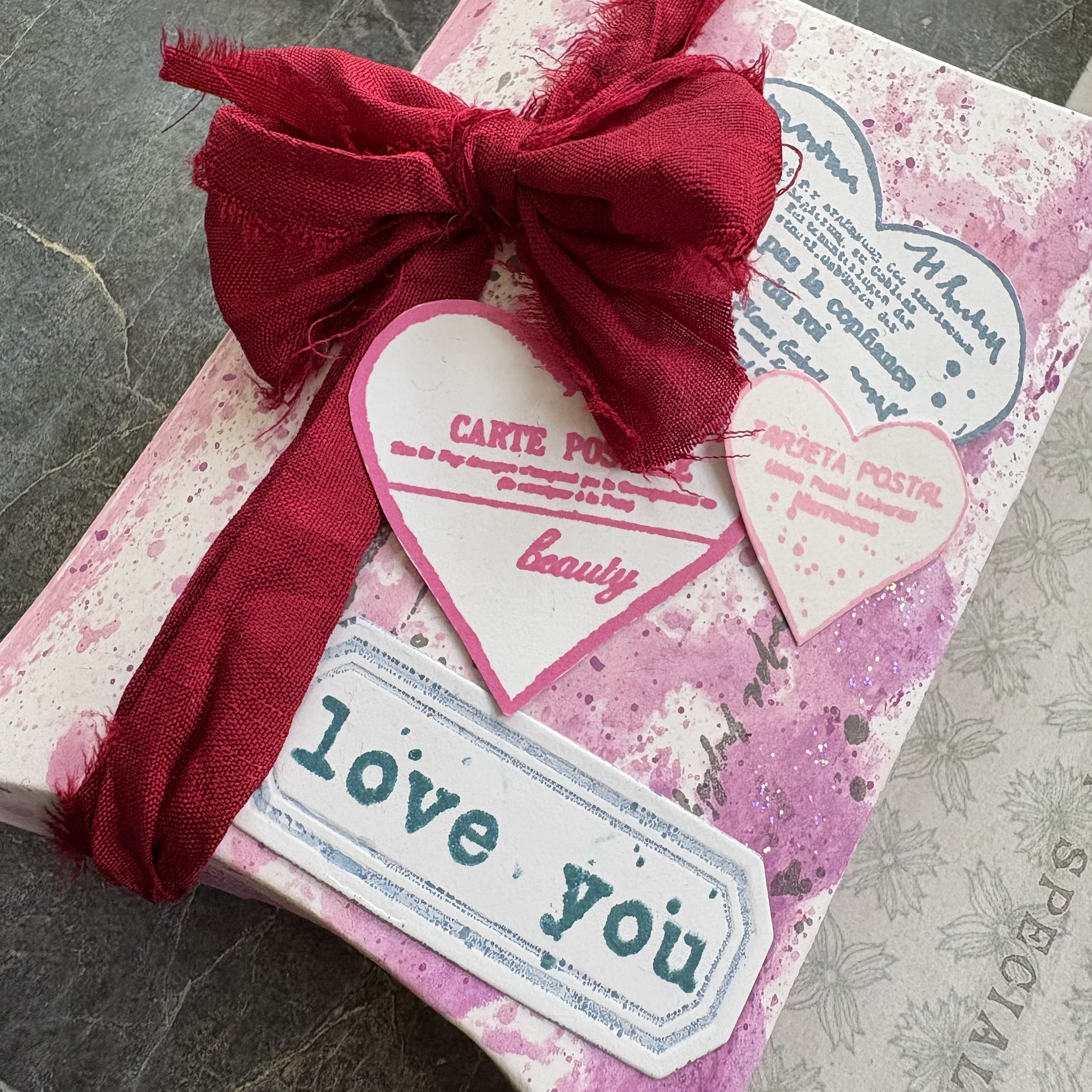
Or not... I felt a little something was missing from the skewer. So I decided to stamp some of the sentiments on Sara Nauman's set (ESN23) on scraps of fabric to male little labels...
Je trouvais qu'il manquait un petit détail pour agrémenter le pic en bois ... J'ai donc décidé de tamponner les petits textes présents sur la planche PaperArtsy de Sara Naumann (ESN23) sur de petits bouts de tissus afin de créer de jolies étiquettes...
... that I coloured with PaperArtsy Fresco Finish Tango (FF72)
... que je colore avec la peinture PaperArtsy Fresco Finish Tango (FF72)
And my first skewer is finally done! The other two were done in the same way.
et voilà mon premier pic est fin prêt ! j'ai procédé de même pour les 2 autres.
I then moved onto the alteration of my spools. I started by cutting three 4.5cm strips in the rest of my Fresco painted fabric. Remember the colours were Candy Floss (FF70) and Tango (FF72).
Je suis alors passé à la déco de mes bobines. J'ai commencé par découper 3 bandes de 4.5cm de large dans mon tissu coton coloré aux Frescos Finish Candy Floss (FF70) et Tango (FF72).
I added a bit of texture with PaperArtsy Grunge Paste (GP190) and the Sara Nauman Stencil (PS092).Yes! you can use Grunge Paste on fabric!
J'ai ajouté un peu de texture avec la Grunge Paste PaperArtsy (GP190) et le Pochoir PaperArtsy de Sara Naumann (PS092)

A bit more stamping on the strips and some stitching as a finishing touch and my spools are ready!
Quelques tamponnages sur ma bande de tissu, un peu de couture pour finaliser et mes bobones sont prêtes !
And here is the finished project! A little home décor that can be use as table decorations for the end of year festivities, or as a gift for your Valentine on February 14th ;)
et voilà le projet final terminé ! un petit home déco qui peut tout aussi bien être utilisé en déco de table pour les fêtes de fin d'année, ou encore en guise de cadeau pour votre valentin ou valentine au 14 février prochain ;)
I really liked working on this project. I love reusing, recycling, and altering objects like the spools in my makes. The sentiments and patterns this stamp set by Sara Nauman
(ESN23), with their grungy touch, are great for this kind of project.
J'ai vraiment apprécié faire et travailler sur ce projet. J'aime beaucoup l'idée de la récupération, du détournement et recyclage d'objets, ici les bobines et des chutes de tissus, dans mes créations. Les motifs, textes et police d'écriture de cette planche de tampons PaperArtsy de Sara Naumann (ESN23), avec ce côté grunge, sont top pour ce genre de projet.

I am using this post to also wish you all very Happy Holiday season. May your December be festive, full of warmth and precious family/friend moments. May January bring you joy, love and sharing. I will see you next year with a head full of creative projects!
See you soon... Mi Mii xx
Je profite de ce projet, pour vous souhaiter de joyeuses fêtes de fin d'année. Que votre mois de décembre soit festif, rempli de chaleur, de bons et précieux moments en famille et/ou entre amis. Que ce mois de janvier à venir soit synonyme de joie, amour, partage et vous apporte le meilleur. Au plaisir de vous retrouver ici l'année prochaine avec des projets créatifs plein la tête.