Pages

Monday, 31 July 2017

2017#10 Dark to Light: Birthday card using ZinskiArt {by Wendy Mallas}

2017 Topic 10: Dark to Light: Contrasts & Layers {by Wendy Mallas}


There are so many great tips and ideas within this post from Wendy. She shares great ideas to show how you can add more personality and individuality to a stamp. Particularly if it is a person, colour and shading can quickly allow you to create bold differences with ease.


Hi everyone, it's Wendy with you today, and I'm super excited to share a fab birthday card with you.

I chose this technique because I needed to create a card in the dark style of Tim Burton and I thought that the Elena Zinski Art stamps would be absolutely perfect. I love black and white as a combination too. It's always so striking! So Zinski vs Tim Burton - who'd have thought it? 


I began with Fresco Acrylics in Snowflake and Little Black Dress. I just kept adding and blending the two from corner to corner until I had the desired mix. It's always so satisfying blending Frescos. However, it was quite a hot day and they needed a little encouragement with a touch of water.


I had decided to take one of the girl monsters from Elena's new (ZA13) stamp set (stockists list here)... 


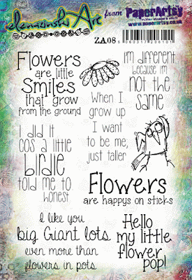
 ...and give her a sassy new skirt with the flower from ZA08.


This took a bit of careful planning and the first ever use of my Stamp-a-ma-jig (which I've had forever!) A little bit of masking also did the trick...


...Some correction and alteration with Fresco Chalk Acrylic in Snowflake and some fussy cutting and she was ready to paint in glorious technicolour, namely Claret and London Bus for her clothes and Chalk and Slate for her skin tones. POP!


The top part of the flower looked like she had a bit of a tummy. Who said there are no surprises? I loved that! And instead of spotty leggings, I gave her over-the-knee stripy socks. How diverse are Elena's stamps? Wow! 


As it happened, if I turned the background around, it looked like she was looking at the moon or in the limelight. I love it when a plan comes together. Just double check the placement before it's all stuck down.


And, although the original image is so very, very cute, I was also really pleased with my 'Burton treatment' of her face. 

I loved making this card. The flower skirt was a little tricky to get right as it wasn't quite the same size, but it worked out fine with a little manipulation of the lines. Why not have a go at altering a stamp to match another artist's style? It turns out it was a lot of fun and I will certainly do this again. Although I think I will use some PaperArtsy Fresco Drying Retarder if the weather is warm again. I hope you have a go too. 

Wendy this makes my head hurt thinking about the planning to get the flower-skirt to work, but yay for the thingy-ma-jig so you could get everything lined up perfectly! you nailed it! I think she looks wonderful! I totally adore the colour combo with the moonlight background. What a fantastic result! ~ Leandra


We always hope that you  learn something interesting from our blog

Our creative team love to read your comments so much, so please take time to let them know you've been inspired!  

Why not join our 2-weekly challenge by blogging your create response to the current topic and link it here?

The current topic link Topic 10 (Dark to Light) will close 17:00 (London Time) Sunday, August 5th 2017, and the winner will be announced 2 hours later at 19:00.

All links go in the draw to win a £50 voucher to spend on products of your choice from the PaperArtsy online store.

Sunday, 30 July 2017

2017 #10 Dark to Light: Facelift anyone?? {by Hazel Agnew}

2017 Topic 10: Dark to Light: Contrasts & Layers

I adore the way Hazel jumps in the deep end and challenges herself to try something different. In this post she bravely experiments with colouring a face dark to light, the absolute opposite of how we would normally work. The good thing about colouring faces with unusual shades is that there are no expectations of right and wrong, so come on...what's the worst that could happen!

Hi everyone, it's Hazel Agnew from Mellifluous Meanderings with you today, and I'd like to share with you a portrait for the non-drawing fraternity and also incorporating some fab stamps from Emma Godfrey.

The topic of dark to light lends itself easily to portraiture, and as some of you know I have practised my face drawing quite a lot since I attended a great class by Dina Wakley a few years ago. I recently discovered a technique to get around the drawing part and you can tweak your squidgy bits too, hence the title about facelifts!


I had so much fun creating this and laughed so much at the grotty stages that my face went through. But it made it, with fuller lips, stronger jawline and brighter eyes! Well, a girl has to do this! 


Here are my colour choices for the flowers and my face. I used opposites on the colour wheel for my background, Pumpkin Soup, Banana and Tikka Fresco Chalk Paints.


Here is my master board for the flowers starting with brayering. You will recognise many PA mini stamps. I used EEG14 flowers and heat embossed with white to make them stand out.


Whoops, happily sponging the background and then realised that I should have left the face area clear. Hand gel to the rescue, it cleared the paint away really well. 


I forgot to mention that printing out your photo in black and white helps you to pick out the contrasts when you are painting. Here is my tracing. I used baking parchment.


This was the scary part, putting down the dark layers first. Then have fun and build up the colours using your photo as reference for dark to light shades.


So, there is my facelift enhanced by Emma's beautiful flowers.

You could have a go with a magazine face if you wished, not so many lines to paint in, or you could paint a picture of a child perhaps.
A good way to start is to make a few copies of your photo and and paint directly onto it  to get the feel of it and then chuck it into the bin.
I hope that I have encouraged the "I can't draw" brigade to have a go!

So, its hi and bye from Hazel, Mellifluous Meanderings, aka craftroomgran and thank you for looking at my ugly, but enhanced mugshot!

Wow Hazel, what an amazing lesson that is! I love your face lift! I also love how you have cool colours, but it looks like towards the end you have a few warmer layers in there too! Looks like a lot of fun to me!! ~ Leandra


We always hope that you  learn something interesting from our blog

Our creative team love to read your comments so much, so please take time to let them know you've been inspired!  

Why not join our 2-weekly challenge by blogging your create response to the current topic and link it here?

The current topic link Topic 10 (Dark to Light) will close 17:00 (London Time) Sunday, August 5th 2017, and the winner will be announced 2 hours later at 19:00.

All links go in the draw to win a £50 voucher to spend on products of your choice from the PaperArtsy online store.

Saturday, 29 July 2017

2017 #10 Dark to Light: Layers and Light with ESA {by Nikki Acton}

2017 Topic 10: Dark to Light: Contrasts & Layers

Canvas featuring Seth Apter / PaperArtsy ESA05, Wood Chips and Fresco Chalk Paints - by Nikki Acton

I think Nikki is loving this theme, not only has she combined her love of 'all things Seth', but she also has mashed up Alison's gorgeous new quotes, and in the process given real-life dimension to Seth's stamps - exactly as they were intended to be used! The details are delicious!

Hi everyone, it's Nikki, from Addicted to Art, with you today, and I'd like to share my Dark to Light canvas featuring the amazing new stamps from Seth Apter with a few Alison Bomber words thrown in!

As I was featuring Seth's stamps I decided my Dark to Light technique should be based on Seth's own style. Since attending a couple of his workshops last year this is a method I now use frequently - the results are fabulous!


Canvas featuring Seth Apter / PaperArtsy ESA05, Wood Chips and Fresco Chalk Paints - by Nikki Acton
Starting with a 5 x 7 inch canvas board painted black (Little Black Dress Fresco Chalk Paint) I built up my layers using other Fresco Chalk paints (Caribbean Sea, Antarctic and Mud Splat ) firstly randomly with my paint brush and finally using Seth's watercolour card printing technique. I love how the remaining black on the surface contrasts with the lighter / more vibrant colours.

Canvas featuring Seth Apter / PaperArtsy ESA05, Wood Chips and Fresco Chalk Paints - by Nikki Acton

This building up of painted layers creates wonderful textures and is a very easy to achieve worn, grungy look.


Canvas featuring Seth Apter / PaperArtsy ESA05, Wood Chips and Fresco Chalk Paints - by Nikki Acton

I used Seth Apter's recently released stamp set ESA05 (stockist list here) - which has so many possibilities. I wanted to use the wonderful large image but decided to remove the central portion. To add to the grungy feel I also scratched over the stamped surface. These stamps are perfect for layering and building up a collage - don't be afraid to cut away the pieces you don't want!


Canvas featuring Seth Apter / PaperArtsy ESA05, Wood Chips and Fresco Chalk Paints - by Nikki Acton

This theme was a perfect fit for one of the wonderful quotes from Alison Bomber's new range of stamps. (EAB02 - stockists here)


Canvas featuring Seth Apter / PaperArtsy ESA05, Wood Chips and Fresco Chalk Paints - by Nikki Acton

I mounted the words on the circular stamp from ESA05 which sits wonderfully on Seth's Wood Chips. 

 Canvas featuring Seth Apter / PaperArtsy ESA05, Wood Chips and Fresco Chalk Paints - by Nikki Acton

I chose to stamp the other elements from Seth's stamp set on card I painted in coordinating colours and cut out before mounting on a little greyboard for dimension. I can see these being used on lots of projects!


Canvas featuring Seth Apter / PaperArtsy ESA05, Wood Chips and Fresco Chalk Paints - by Nikki Acton

I wanted to create a frame for my canvas board so took some wooden dowels and painted with Caribbean Sea Fresco Chalk Paint before wrapping in black string. 


These new stamp sets from Seth are based on his own artwork and I love how they can be combined, altered and layered! Seth loves using found objects in his art and these stamp sets reflect some of those items. He also loves working Dark to Light, building up layers which I have done here, to create my grungy canvas - but I can see these being used with brighter colours too. The larger stamp on each set provides a natural focal point to be used as it is or added to, and the other stamps are perfect additions or background stamps for just about anything!

Happy crafting!

Nikki

Blog: Addicted to Art
Pinterest: NikActon

Bravo Nikki! I totally adore all those painterly layers, but then when you stamped and scratched at the grungy Seth stamps....this seems to magically make the layers look even more interesting and 'olde-worlde' ! Fantastic! ~ Leandra


We always hope that you  learn something interesting from our blog

Our creative team love to read your comments so much, so please take time to let them know you've been inspired!  

Why not join our 2-weekly challenge by blogging your create response to the current topic and link it here?

The current topic link Topic 10 (Dark to Light) will close 17:00 (London Time) Sunday, August 5th 2017, and the winner will be announced 2 hours later at 19:00.

All links go in the draw to win a £50 voucher to spend on products of your choice from the PaperArtsy online store.

Friday, 28 July 2017

2017 #10 Dark to Light: Memories of Summer {by Carol Fox}

2017 Topic 10: Dark to Light: Contrasts & Layers


How many times do we make stuff 'just because' ?? I would probably do a lot more 'just because' activities if time and lifestyle allowed, as I'm sure would you too!! But don't you sometimes find non-crafters very puzzled by what we do and make and particularly why we do these things!? Well tonight we have an article made by Carol with clear purpose! Hurrah! And she magically uses Vintage style items with bright and zingy colours! Ohhhhh!

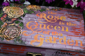
Hi everyone, it's Carol with you today, and I'd like to share with you a box that I have altered using pink on pink tones and then a bright pop of contrast for the more decorative elements. I love roses especially the old fashioned kind, when my Mum was alive she planted both sides of the long path to the front door with heavily scented roses so when you walked along it they brushed against you and smelt amazing, these were the lovely roses that open yellow and turn with a tinge of orange and pink as they start to fade, I have used these as the inspiration for the roses on my box, hoping to conjour up the feeling of long ago summer days spent lazing in the garden with heavenly scents around you.


Although I started off with a very dark base this did not turn out at all like I envisaged it would. I had a much darker with a vintage twist picture in my head, but that is the wonder of paint, sometimes it just knows what it best and ignores you. The pop of shades of orange on top blend more than clash as I had hoped, but for me this box is a keeper as I really love the combination of the stamps, how well they all worked together and how it turned out. I will at some point add feet to the bottom, but I need to find some old re-claimed things to use for these, so the search is on for just the right thing.


When altering a box I always start off with a good paint base, here I used Plum Fresco Chalk Paint and layered up tones of pink in Sugar Plum Fresco Chalk Paint and  Bubble Gum Fresco Chalk Paint. PS064 can be found here.


I used the wall element off the PS064 stencil and Sherbet Fresco Chalk paint to add a bit of structure to my background and to stop it looking so "splodgey". 


I loved the butterflies on the Scrapcosy set ESC04 and I decided to layer them onto the side of the box using the text on the set as a collage background.


I now added a bright pop of contrast to my box using text from PS064 and Fresco Chalk paints in Coral, Tangerine Twist and Butternut, I stippled these on with a brush mixing and layering as I went to get a shaded finish.


I had a good root through my colouring pencils and found shades of orang, yellow and red that matched my choice of Fresco Chalk paints and coloured in my roses. I had a little faff around and got them laid how I wanted on the lid, trimming odd leaves off and putting them in a different spot so they gave me a nice layout and filling gaps with butterflies. I then took a photo before I took them off to stick down, how  many times have I not remembered where I want things to go, so I now always take a quick snap.


I used  Smoked Paprika Fresco Finish Chalk Paint and Stencil PS036 a favourite filler stencil for me to add a bit more colour to the box, going round all the sides and lid to tie the whole design together.


The detail on all the stamps is amazing, but the butterflies are my favorite, after trying several inks I found the best detail was kept by using Versafine ink, and here although I have coloured them over very heavily with Prisma Colouring pencils the detail on the wings is if anything better, as my pencils seem to have made the black spots pop off the wings. The images along with the text background would make a lovely quick card, all you would need are these and a squiggly hand drawn border and bam a five minute card.

I hope you enjoyed my make,

Carol Xx
I think your shading is amazing Carol! It does seem with detailed images such as these, they do really 'pop' once colour is added. Colouring them always brings them to life, the cool thing with butterflies is you can make them look different each time with varying colour options, despite being the same stamp. Great post! Thankyou! ~ Leandra


We always hope that you  learn something interesting from our blog

Our creative team love to read your comments so much, so please take time to let them know you've been inspired!  

Why not join our 2-weekly challenge by blogging your create response to the current topic and link it here?

The current topic link Topic 10 (Dark to Light) will close 17:00 (London Time) Sunday, August 5th 2017, and the winner will be announced 2 hours later at 19:00.

All links go in the draw to win a £50 voucher to spend on products of your choice from the PaperArtsy online store.

Wednesday, 26 July 2017

2017 #10 Dark to Light: Color Diffusion {by Dounia Large}

2017 Topic 10: Dark to Light: Contrasts & Layers - Color Diffusion

Have you ever tried to paint over the top of something only to have the colour bleed through? Did you get mad? Well Dounia doesn't get mad, she gets even! How cool to explore that effect deliberately to see how she can encourage colour-bleed! I love this idea!

Bonsoir everyone, Dounia from France with you tonight, playing with the diffusive properties of water reactive inks. I turned my playing session into a few simple cards to show you the possibilities of this technique.

You've probably already encountered this phenomenon of white ink or paint taking the color of a previous layer. When it is accidental, sometimes you enjoy the new nuances and sometimes you despair of obtaining a true white. Here I'm doing it on purpose. I find it a rather quick and easy way to make backgrounds or elements with soft tones yet with high visual impact.


Bringing back white over dark layers can be quite the quest, the result looking weak or necessitating numerous applications. The idea here is to purposely tint the white, which makes everything actually easier. The first step is to create an under layer with water reactive inks (so no acrylic inks!). Here I used watercolor ink, distress inks and infusions. I like brighter colors but it works with any deep color (the yellows here actually are a bit light and did not work so well).


Then you take a fortifying breath and you completely cover you design with a layer of opaque dark paint. Black brings the most contrast obviously but dark blues, greens, purples or browns can yield very nice effects too. For example I did a series using Chocolate Pudding Fresco Acrylic paint (it is a semi opaque so I needed three coats instead of the usual two for total coverage - I need to learn to read labels!). Once the base is ready, it is time for the light layer. Any water based white product potentially works for that, meaning you can stamp, stencil, write, free hand, anything you like

I advise experimenting with the different products you may have to see how they react. In this sampler, all developed a tint (even the paint) but both the underlying and top inks influenced the final color.


The depth of color mainly depends on the water content of the white product, as it needs to reactivate the colors beneath. Therefore when stamping, after inking, it always helps to spray water once or twice on the stamp, or more for a watery effect.


This georgeous sprig is from Lin Brown's ELB29, I used pretty much all the stamps in this set! Most of her designs work really well with this technique as they are quite solid.


Bold designs also make good focus elements. You can easily make a coordinated background by using the same inks as in the underlayer.


Texture stamps make for great and easy backgrounds. Here I stencilled the flower duo from PS024...

... also by Lin Brown, with Grunge Paste. It is not really visible on the picture but the Grunge Paste also became slightly tinted, harmonising with the backgroung while still providing contrast (these subtle shades are quite difficult to photograph, sorry).


Another interesting way to create dramatic visual impact is to bring in some true white, which will emphasize the colors. One sure way to have a white that stays white is embossing powder. Just a little makes everything pop!

Bold is not the only way to go. Delicate and busy stamps, like the fauna and flora of ELB07, also give great results.


You can play with the contrast between tinted and pure white:


Or you can add other shade by using two white products with different reactivity (here ink and paint):


Stencil & stamp combos, like ELB20 and PS014, also give great results with this technique.


You can play with the varying shades of white or bring back some black for a night scene...


VoilĂ ! These are just a few possibilities, you can have hours of fun playing with the colors, layers and contrasts, it is pretty much always striking. I must warn you that the infusions are a bit unpredictable as an underlayer in this technique. They work but the powder/water ratio needed is a bit fiddly, so maybe do not make it your first attempt! Also, you don't have to limit yourself to cards, this technique works for masterboards, jourmal pages, etc... I hope this inspires you to try creating in not so black and white.
 

Stay curious! Dounia x.
Blog: Doudoulina

Oh me oh my! I have never deliberately pulled tints to the surface in this way! I love how you have created so many variations on the theme, and its awesome to see how it works with different non-permanent dye products too! What a fantastic theme to explore! Thanks you for sharing your ideas Dounia! ~  Leandra


We always hope that you  learn something interesting from our blog

Our creative team love to read your comments so much, so please take time to let them know you've been inspired!  

Why not join our 2-weekly challenge by blogging your create response to the current topic and link it here?

The current topic link Topic 10 (Dark to Light) will close 17:00 (London Time) Sunday, August 5th 2017, and the winner will be announced 2 hours later at 19:00.

All links go in the draw to win a £50 voucher to spend on products of your choice from the PaperArtsy online store.