Pages

Monday, 31 October 2016

2016 #21 Acetate Mounted Cards {by Pavla Hozikova}

2016 Topic 21: Typography, Fonts, Quotes


Hello everyone, it’s Pavla here with my take on the topic of Typography, fonts and quotes. 


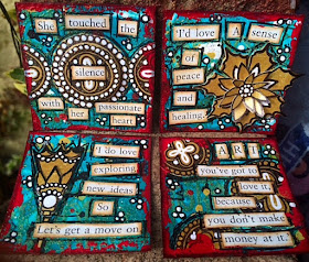
My artwork is full of words and quotes. What I like to do is to take a quote and highlight a word or two. I usually print the quote and make my chosen word bigger, or replace it with a different font or use some big alpha stickers. I found out that Emma Godfrey’s stamp sets are absolutely ideal for this. They have one big word and several quotes that usually contain this word – which makes it ideal for replacing. Tonight, I’ll be creating two cards with Emma’s quotes.


Step One: I cut two square pieces of acetate – because I like to work on square shapes. I stamped one with the swirly circles from Emma Godfrey’s EEG07 stamp set and the other with the “snowflakes” from Emma’s EEG19 set. I used the white StazOn inkpad. 


Step Two: Next, I cut two smaller square pieces of cardstock and created two different backgrounds using various Fresco paints. I watched several videos on YouTube studying Seth Apter’s signature technique of “printing” with structured paper on paper. I’m in love with this technique, the effect it creates!


Step Three: Next, I added more stamping. The tiny stars are also from EEG19 set, the spiky circles are from EEG15. I outlined the stamped images with paint pens to highlight them a bit. 


Step Four: Now, the quotes. I stamped my chosen word/quote combination on black cardstock in white ink and on a piece of velum in black ink. At this point, I didn’t know which I was going to use but it turned out I used both versions in the end...


Step Five: I attached the two backgrounds on the acetate pieces and created a simple card for the back side to cover where the front pieces are glued to the acetate. I used the same stamps and added a smaller quote. 


Step Six: To finish the front, I took my paint pens and added some accents here and there. 


I hope you liked this simple mixed media cards. See you some other time!
Pavla

Blog: pavlart
Instagram: pavla_art

Oh Pavla, thank you for showing your acetate backgrounds, those are beautiful and a brilliant idea to add another dimension to a card. Using words as a focal point really gives them weight and meaning. As you say Emma's combinations of text are perfect for this. ~Darcy

All of our bloggers love to see your twist on their ideas,  particularly if you were inspired directly by their post; so please spare a moment to comment or make your own creative item. They all love to see your feedback and what you can do more than you realise!

We would love to see how you interpret this Typography,Fonts and Quotes topic by linking what you make to our 2016 Challenge #21: Typography,Fonts and Quotes, on this page HERE. The 'Typography, Fonts, Quotes' link will close 17:00 (London Time) Sunday, Nov 13th 2016. The winner will be announced 2 hours later at 19:00.
All links go in the draw to win a £50 voucher to spend on products of your choice from the PaperArtsy online store. 

Sunday, 30 October 2016

2016 #21 Typography,Fonts and Quotes {Challenge}

 2016 Topic 21: Typography,Fonts and Quotes

Naboko
Well hello everyone, Darcy here with a new topic, this time we are exploring Typography, Fonts and Quotes. This is a huge, gigantic topic as there is almost an unlimited supply of fonts, especially if you take into account your own handwriting. 


Before we start, let's see who won the Topic 20: Squares and Grids Challenge...
What a great challenge, it really opened us up to seeing all the squares and grids that are around us. The pieces you submitted were wonderfully varied with lots of textures being added and a good mix of regular and abstract. Lovely to see our latest stamps from Elena making appearances too. 

The winner of Squares and Grids  is: Sue  from Sue the Iron
Email Darcy to claim your prize. Darcydotneedles@gmail.com

Written communication with letters and symbols began around 5000 years ago, this development enabled various cultures to record their own histories, laws, stories, experiments and advancements. Within around 500 years we were moving from tablets of clay to papyrus. Not only did this speed up the process it also meant that letters and symbols shifted from being very angular (carved) to a rounder style (brush and ink). Around this time the scribes also began to change from a top down system to a left to right system. 

The rise of the Roman empire enabled formal lettering styles to spread across Europe, and by 400 AD this was an everyday style used in transactions and bookkeeping. As more people used written correspondence the writing style became looser, letters began to flow together and we saw the beginnings of lowercase. 


Of course all regions and religions also had their own style of writing. The ones we are most familiar with are the Celtic styles that we see in Illuminated manuscripts. These began very formally over a 1 inch grid, over time this decreased to a 1/2 inch system, the letters became more and more rounded and spacing became more regular which improved readability. 


 Benjamin Harff
By the 1400's the movable type press was in use and we saw printed material being commonplace, over time, and with the introduction of copperplate engraving, the fonts used became more delicate with many flourishes being added. 


Interestingly the printed word encouraged a loop back to hand written documents. Handwriting masters began to appear, and their services were in high demand. Having elegant handwriting became a status symbol.

Nowadays, handwriting in everyday use is no longer valued as much, now that we can have printed words at the touch of a few buttons. The love of typography and especially fonts has not diminished though, in fact it is increasing, especially when used in creative ways. 


Anahi Decanio
When you choose a font or quote, there are a few things to consider. Firstly of course you may have favourite fonts, but then there are the considerations of size, spacing, style and general appearance. 

Just like you deliberate over colours and images your addition of text should be an integral part of your design, never an afterthought. Text can be supporting, enhancing or distracting, it can be in the background or a focal point. Making even small changes to which font or size that you use can hugely effect the overall appearance or impact of your project. 

Scrap Art Studio
Of course you could work in a more intuitive way like Tracy Scott and just go for it. 


Fonts and quotes can be found everywhere, we are surrounded by them Inspiration is not lacking. Look to magazines or free leaflets for background material like this piece. 


Pixel Fantasy
Never underestimate your own handwriting though, you can learn some amazing lettering techniques. 

Valerie Sjodin
Here is a great video from Shayda Campbell to get you started, but do check out her channel as she has lots of lettering videos.  


Once you have practiced styles and placement you can add amazing text to all your work. 

Sam Cannon
It is worth while searching for quotes that really speak to you, Pinterest is a great place to look as is The Quote Garden. Why not decorate a notebook and fill it with just your favourite quotes. 
Another source is your own bookcase. Quotes from children's books always make me smile, they tend to be full of innocence and nostalgia. 


As for ways to use all fonts and quotes available, how about this fabulous staircase. 


HouseofTurquoise
This would be easy to replicate with Fresco paint and stencils. I really like the mix of upper and lower case plus numbers. 


Song lyrics are also a great source of wordery, this beautiful piece is made using Bob Marley lyrics.note how the different fonts and sizes are used to suggest shape and direction. Something else that is making this have such impact is that the piece is on a black background. 


Cris Wicks
Here Jose Naranja makes notes in his journal while he reads a book, Anna Karenina. the end result is a mind map of sorts. At first glance it looks jumbled and chaotic, but look closer and each character is written beautifully, the colours, style, sizes are considered and make for a lovely journal page.


Don't assume your use of words needs to be flat, why not think about how you can add texture and dimension. This stitched journal is just lovely, with it's mix of watercolour paint and thread. 


Danielle Sayer
More stitching, this time machined words on a water soluble fabric. 


Maria Wigley
This canvas makes great use of different fonts , sizes and placement to suggest the form of the petals. 


Another example showing how the font and size choice can enhance the design. 


Glen Wolk
A great example here how the size of the text compliments the artwork, it does not overwhelm. The coloured letters add a childlike quality and the quote itself is completely in keeping with the sentiment of the image. 


Studio Duda
Remember to mix up your fonts and sizes to add interest. 


Gina 

Take this next two weeks to show us your favourite quotes. Try out different fonts on your computer, search for free fonts, there are thousands available, see what you can find. Work on some hand lettering, how can you change it up? Whatever you do, have fun and share your projects with us as we love to see them. 

Don't forget to follow Darcy and Leandra's Pinterest boards if this topic pushes your buttons, you will see plenty more examples to whet your appetite there! 

I am really looking forward to seeing what you create over the next 2 weeks!


Darcy


Topic 21: Typography, Fonts and Quotes PaperArtsy Blog Challenge


We'd love you to share your ideas and link up your creative response to our current blog topic. Take a minute to read the challenge guidelines below.

All links go in the draw to win a voucher to spend on products of your choice from the PaperArtsy online store. The Typography,Fonts and Quotes link will close 17:00 (London Time) Sunday, 13th November, the winner will be announced 2 hours later at 19:00.


1. The challenge is a for you to show how you are inspired by the current blog topic.

Your entry should contain:
- a mention of which post inspired you and why, and 
- a link in your blog post to that original post on the PA blog.

The whole concept of this challenge is 'play along with us'. You are encouraged to put your own twist on ideas you see on our blog, do your own thing - whatever grabs you!

2. The link you put on our linky page must lead directly to the specific post on your blog where you have explored the technique/ idea mentioned in point 1 above. Don't link to the home page of your blog.

3. We prefer your challenge blog post is created exclusive to our challenge, but if our topic fits perfectly with another challenge, then you may link to both if appropriate.

4. You are most welcome to use stamps/ products/ substrates you have to hand from a variety of companies, we do not expect you to exclusively use PA products - it's lovely when you do though!

6. You can enter as many times as you like. We don't want to restrict your creativity! 
NB. Link closes at 17:00 Sunday 13th November   (London Time)

7. The winner of the random draw will receive a £50 credit voucher to be redeemed on the PaperArtsy Website. The credit voucher includes VAT and postage. We request that one of your purchases is an A5 rubber stamp. You can add any other items to your basket, but the final total should not exceed £50.

8. Each fortnight on Sunday, the winner will be announced at 19:00 (London time). In the same post, the link for the next fortnight will be posted. 

9. It's your responsibility to claim your prize coupon from Darcy. 
email: darcydotneedles@gmail.com

Good Luck! If you have any questions, don't hesitate to ask!

Saturday, 29 October 2016

2016 #20 Gothic Twinchies {by Tracy Scott}

2016 Topic 20 Square and Grids

Hi there everyone. Tracy here today with a post for this months theme of 'squares' and 'grids' on the PaperArtsy Blog.


Instantly my mind went to those fabulous miniature works of art that are 'twinchies' and 'Inchies'. I loves me a miniature work of art and the twinchies (2x2" square) are definitely a favourite of mine. 

Step 1: Choose a selection of paint colours. I chose MermaidCaribbean Sea, BoraBora and South Pacific, using a small brayer I mixed the colours all together on a sheet of glossy card.


Step 2: Whilst the paint is still wet and using the end of a paintbrush I scratched some swirl designs into the paint.


Step 3: I used an embossing ink pad and stamped various images from my Gothic Blooms ETS03 stamp set...

...and added gold embossing powder before heat setting into place.


Step 4: next I added stamping from ETS03 in Jet Black archival ink and added paint splatters using Little Black Dress, Snowflake, London Bus and Gold paints.


Step 5: Cut your master board into 2x2 inch squares ready for decorating


Step 6: Using a piece of Smoothy cardstock, I brayered the whole page in gold and then stamped images from ETS03 stamp set.


Step 7: Using the various images I stamps in gold and found book text I then decorated each of my 2x2" squares adding black and white pen work to finish off.


I decided for this project to use my new stamp set ETS03 to highlight some of the things you can do with it, these little magical works of art are just amazing for trying out new techniques or stamps that you might otherwise be intimidated to give a go.


I had an absolute blast creating these little gems and would just love to see what you can do too !!!!

You can check out more of my work at....

Www.facebook.com/myjournallingjourney


Thanks for stopping by. I hope to see you all again soon

Bright and painty hugs
Tracy
X

Wow, the colour scheme and imagery from your stamps really does feel very Regal with a Gothic vibe. So many elements on such a small surface, and they look gorgeous! I can imagine them arranged into a teeny tiny book too. Thanks Tracy, this is a lovely way to use your stamps! ~Leandra

All of our bloggers love to see your twist on their ideas,  particularly if you were inspired directly by their post, so if you can spare a moment to comment or make your own creative item, they love to see your feedback and what do do more than you realise!

We would love to see how you interpret this Squares and Grids topic by linking what you make to our 2016 Challenge #20: Squares and Grids, on this page HEREThe 'Squares and Grids' link will close 17:00 (London Time) Sunday, Oct 30th 2016. The winner will be announced 2  hours later at 19:00.

All links go in the draw to win a £50 voucher to spend on products of your choice from the PaperArtsy online store. 

Friday, 28 October 2016

2016 #20 Funky Squares {by Hazel Agnew}

 2016 Topic 120: Squares and Grids

Hi everyone Hazel, from Mellifluous Meanderings here.

Tonight I'd like to share with you this evening a post about creating shapes within squares that work in relationship to one another.


This is a way of playing with stamps where you look at them in a totally different light. Instead of using the whole stamp, it is interesting to explore smaller parts of them.


Step One: First of all I cut up lots of squares of coloured paper and stamped with clear embossing pad and sprinkled with Black Wow powder that had a hint of sparkle. I stamped far too many of them as I wanted to fiddle and play to get my best combination of patterns and colours. 


Step Two: I decided to use a sparkly background, influenced by a piece of art by Damien Hirst where he placed coloured circles onto a black glittery background. I placed the shapes onto various background colours before I decided that chocolate brown worked the best.


Step Three: I mounted each little square onto black card to give it extra definition and then used foam pads to add extra dimensional interest to the piece.

Here is another version of this exercise, this time, instead of using one stamp in many ways, this one uses all the stamps from the set. As you can see, I have mounted these onto black glittery card.


Finally, here is my first piece, photographed, mounted onto a linen box frame, showing the 3D effect.


I can imagine that this technique would work well with Christmas stamps and then used to make Christmas cards. You can easily adapt the sizes of the squares or maybe use other shapes in relation to one another.

I hope that you have enjoyed this contribution, I have enjoyed creating it. 

I am Hazel, otherwise known as @craftroomgran on twitter and you can find my blog which is Mellifluous Meanderings.

I think we often forget how effective it can be to use small sections of stamps to create a completely different effect than using it as a whole! I am sure our stamp designers really love seeing such creative take on how stamps could be used. The embossing powder adds another texture to the process, and I love the pops of colour from the card. Nice one Hazel! ~Leandra

All of our bloggers love to see your twist on their ideas,  particularly if you were inspired directly by their post, so if you can spare a moment to comment or make your own creative item, they love to see your feedback and what do do more than you realise!

We would love to see how you interpret this Squares and Grids topic by linking what you make to our 2016 Challenge #20: Squares and Grids, on this page HEREThe 'Squares and Grids' link will close 17:00 (London Time) Sunday, Oct 30th 2016. The winner will be announced 2  hours later at 19:00.

All links go in the draw to win a £50 voucher to spend on products of your choice from the PaperArtsy online store. 

Wednesday, 26 October 2016

2016 #20 Patchwork Backgrounds {by Anneke de Clerck}

2016 Topic 20: Squares and Grids

Hi everyone Anneke here.


I'm happy to be back here tonight with a post about "Squares and Grids". For this topic I've created patchwork backgrounds made from inchies. If you follow my blog you'll know I did inchie backgrounds before. It's a really fun and easy way to add interest to a project. In the past I've punched inchies out of coffee filters, tissue paper, painted paper scraps...This time I've chosen to work with patterned paper. I've created a set of tags using JOFY stamps and the paper piecing technique.
Let's get started.

Step 1: I dug up my leftover scrapbook paper and punched out a bunch of inchies to start with.


Step 2: I worked on 3 Manilla Tags (size 9). I picked 6 or 7 colors for each tag and tried different color combinations until I was pleased with the result. I made a mix of patterned paper and plain paper. 


Step 3: To attach the inchies I've chosen double sided tape. A quick and easy method if there are lots of inchies to glue down.


Step 4: I worked from the bottom to the top and removed the 'backing' on the go. 


Step 5: To tone down the background before stamping I glued tissue paper to each tag using Golden Polymer Medium. On the left you see a background without tissue paper, on the right one with tissue paper on top.


Step 6: I stamped greenery on the tags using various stamps from stamp sets....


and JOFY 42 


Step 7: I wanted to repeat the patterns from the background on the focal piece. So I've chosen the paper piecing technique to decorate the girl. I stamped the girl on pink paper using Archival Ink Jet Black, cut out and used this as a base to glue the dress, boots and hair on. Hair, dress and boots were cut out of paper that matched with each background.


Step 8: I colored the flowers, leaves and grass with Faber Castell PITT artist pens and acrylic markers.


Step 9: I drew on the tag with a white pen.


Step 10: I added shading to the girl using a black pencil.


Step 11: Each tag was decorated with a few matching pompoms. On the dresses I added enamel dots using Tim Holtz Enamel Accents.


I usually work with paints or inks to create backgrounds but from time to time I like to work with patterned paper as well. Making this set of tags was kind of time consuming but I'm pleased with the result so it was worth the effort.

I love the effect of the tissue paper on the patchwork backgrounds. I could have used a layer of gesso instead but this would have hidden the patchwork backgrounds too much in my opinion. If you fancy using this technique make sure to let the tissue paper air dry entirely before stamping and coloring on it. 


This technique is a perfect way to use up scraps by the way! I'm sure we all have lots of patterned paper scraps we never use anymore. But his technique would work well with scraps of painted paper or scraps of gelli plate prints as wellI hope I inspired you to grab your inchie punch :) 

I would love to see what you create, so join the challenge. 

Thanks for stopping by!
I really love the idea of the tissue paper to soften the grid background! I imagine it must also give you a fairly smooth and even stamping surface too for the next layers! Your little dots of enamel accents, and the shading brings it all to life so beautifully, what a lovely way to spend an afternoon with some JoFy stamps! Thankyou! ~Leandra

All of our bloggers love to see your twist on their ideas,  particularly if you were inspired directly by their post, so if you can spare a moment to comment or make your own creative item, they love to see your feedback and what do do more than you realise!

We would love to see how you interpret this Squares and Grids topic by linking what you make to our 2016 Challenge #20: Squares and Grids, on this page HEREThe 'Squares and Grids' link will close 17:00 (London Time) Sunday, Oct 30th 2016. The winner will be announced 2  hours later at 19:00.

All links go in the draw to win a £50 voucher to spend on products of your choice from the PaperArtsy online store.