Pages

Saturday, 30 April 2016

2016 #8 Sizzling Summer Cards {by Wanda Hentges}

 2016 Topic 8: White Space

Hi everyone!!!!  Wanda Hentges here.
I'm thrilled to be back on the PaperArtsy blog and tonight I'd like to share with you a post for the  white space theme.
White space is hard for me.  I did a couple cards last year where I was trying to leave white space and then went right back to my normal which is to cover the background completely with whatever technique I'm using that day and then build upon it.  When I saw white space as a theme this year and today was using Ellen Vargo stamps, which I love, I just had to give it a whirl again.  I've made a set of cards for today and I hope you enjoy them!!!


Step One:  To easily (that would be easy for me to add some color and not continue to fill up the whole background) put color in my background I began by putting drops of paint on my craftsheet.  I used Zesty Zing, Banana, and Bougainvillea.  I put a few drops of each color leaving space between each drop, sprayed each drop with water and used my finger to blend the water and paint of each drop.  I made sure this area of color on my craft sheet would just color the center of a piece of cardstock leaving lots of white around it.


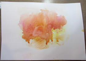
Step Two:  I then laid a whole sheet of Heavy Smoothy Cardstock into the color pressing well but not twisting it around, lifted the paper and this is what I had.  I very lightly blotted in the areas with lots of liquid....


... and then dried the paper.  This is the piece dried.


I sprayed more water over the color left on my craft sheet, took another piece of paper and dipped again.  This time I left all the liquid and just set it aside to dry.  This will get used on a future project.


Step Three:  I took the original paper and cut it into 4 pieces to give me the beginning of 4 cards with plenty of white space.


I really like the EEV10 set of stamps that has 3 flowers and 3 quotes on it and chose this set to finish my cards.  I also added to the background using stamps from EEV06 and EEV07.

EEV06
EEV07.
 EEV10 
Step Four:  I stamped background images from EEV06 and 07 over the colored areas of the cards using Distress Ink Picket Fence. The flowers and words were stamped on Heavy Smoothy Cardstock using Archival Ink Jet Black and then cut out.  Color was added to all the flowers with Distress Ink. 

 The edges of the background panels were distressed and then layered to a folded white card created from Heavy Smoothy Cardstock.  I love the weight of the cards and how they feel in my hands when they are made from the heavy cardstock.  All the words were cut apart and the pieces edged with ink. For all of the flowers, after attaching them to the card, I trimmed the stem even with the bottom of the folded card.


For this card I used a waterbrush along with Squeezed Lemonade and Mustard Seed to color the flower.  The stem was colored using the Mowed Lawn Distress Marker.  The words were edged with Distress Ink Picked Raspberry.  I popped up the flower and words with foam mounting tape. 


Here I've used Picked Raspberry with a waterbrush and then the Shaded Lilac Marker to color the petals.  The center was done with Brushed Corduroy and Rusty Hinge using the waterbrush.  The Mowed Lawn Marker was used for the stem.  The words are edges with Archival Ink Jet Black.  The flower and words were glued to the card and I left the ends of the flower petals loose so they could lift from the card. 


This time for the flower I used an Ink Blending Tool to add the colors, Picked Raspberry and Spiced Marmalade, and then used a White Gel Pen to give it highlights.  The words are edged with Archival Ink Jet Black.  I put foam mounting tape just under the flower head and glued the stem and words directly onto the background 


Those three cards used all 3 flowers and all 3 quotes from the stamp sheet but I still had another background to use.  I decided that instead of making a card to match I would really change it up (giving you all another idea) but still use the same stamps.  I stamped my chosen flower twice, directly onto the background with black ink and embossed them with clear powder.  I then used a Black Copic Marker to color them in.  I used words from 2 of the quote stamps to create the saying on the card both stamping the words and edging the pieces with Archival Ink Jet Black. 


I really had fun making these cards and love how they turned out.  If you are nervous about white space or have trouble stopping yourself and leaving white space, then try this out because it makes it a lot easier.  It's also a great idea if you need a lot of cards and have limited time.  

Thanks Wanda, I would say you have mastered the white space challenge perfectly. I love the pressed, splodged transferred paint in the background, it is always unpredictable but effective. The added background stamping is a great bridge to the focal images. Fabulous colour pallette, so striking. ~Darcy 

We would love to see how you interpret this White Space topic by linking what you make to our 2016 Challenge #8: White Space, on this page HERE.
All of our bloggers love to see your twist on their ideas,  particularly if you were inspired directly by their post. 
All links go in the draw to win a £50 voucher to spend on products of your choice from the PaperArtsy online store. The White Space link will close 17:00 (London Time) Sunday, May 1st 2016. The winner will be announced 2 hours later at 19:00.

Friday, 29 April 2016

2016 #8 Good For Your Soul {by Debs Wainwright}

 2016 Topic 8: White Space

Hi everyone Debs here. Tonight I'd like to share with you a journal page I've created with some white space. I chose this topic because I love the effects you can create, and it is such a challenge for me. I love colour so much and always want to fill my page with lots of it, so often struggle to keep it minimal. There are so many ways to create white space in your art, but not wanting to influenced by others I just went with my intuition, and created in the middle leaving the sides free.


Step One: I have been so eager to get a set of Infusions Dye Stains, as I love the colours and flexibility of powders. So when I did, I couldn't resist using them in this project. In my journal I sprinkled Violet Storms and then using a pearlised spray activated the powder. I got so excited seeing the different colours; the powders have a brown base and the longer you leave them wet, the more the brown shows, giving a gorgeous vintage effect. I didn't want vintage so dried it quickly.


Step Two: I wanted to add a little more interest to my background so used a script stamp and Archival Ink in Sky Blue and added the words where in areas that would peep out from the focal point. I stamped my feature using Hot Picks 1507, and Archival Ink in Black. I heat set the ink as I didn't want it to move.


Hot Picks 1507


Step 3: at this stage I was itching to have more on my page but manage to restrain myself and settled for adding a little Vibez Spritz and let it run down the page. I do love drips!

 
Step 4: I wanted to bring my feature alive and so using Fresco Acrylic Paint in Southern Skies, I painted the flower, and for the butterflies I used a mix of China, and Glass Blue. The China being Opaque I lost the detail of the butterflies and so with a black pen I created these patterns, which were intend to knock the blue back a bit as I didn't want it too bright. I stamped my Sentiment from the same stamp plate Hot Pics1507 with Archival Ink in Black.


In this close up you can see how the Pearl Spray has caught the pigments of the Infusions Dye Stains making them shimmer, which is hard to see when looking at the page flat.


Well for someone who usually covers the page, herself, and anything near by, I don't think I did bad to keep some white space. And if I can do it anyone can. I hope this has inspired you to have a go, pick the area you want to stay white and create around it. Simple...
Well not simple, but not as hard as it looks. 
You can see more of my work on the following links, I also teach a monthly workshop at Birds In The Barn.

Well done Debs for hanging onto that white space, really not always an easy thing to do, especially with pigments and sprays. Lovely combinations of colours with the Infusions and paints. ~Darcy
         
We would love to see how you interpret this White Space topic by linking what you make to our 2016 Challenge #8: White Space, on this page HERE.
All of our bloggers love to see your twist on their ideas,  particularly if you were inspired directly by their post. 
All links go in the draw to win a £50 voucher to spend on products of your choice from the PaperArtsy online store. The White Space link will close 17:00 (London Time) Sunday, May 1st 2016. The winner will be announced 2 hours later at 19:00.

Wednesday, 27 April 2016

2016 #8 A Box of Cards {by Ellie Knol}

2016 #8: White Space

Hi everyone! Ellie Knol here, joining you this evening with a post about white space.

White space can be dramatic; highlighting the focal point of your project!. I always try to add a lot of contrast, as that is what ART is about, isn’t it? Without contrast, there will be no expression in your project. What better way is there to add contrast than (a lot of) white space?

I’ve made a box from cardboard (to fit the envelopes and cards), and used the same technique on the outside of it, as I’ve used on the six cards inside it. It will make for a nice and unique gift!  I’ll show you the step-by step of the box, the decorating of it.


Step One: Make a box for the cards with cardboard (3mm thick). Paint the bottom part of the box with a dark brown acrylic paint. Now for the lid of the box - crinkle up some blotting paper and cover the whole of it by glueing it to the surface with decoupage glue; this creates a beautiful texture. Leave to dry. Paint it with Fresco Finish Chalk Acrylics (Snowflake). This gives a nice chalky surface to use as a base for the technique. 


Step Two: Tap a little bit of Nuance and Bistre powders onto an acrylic block (the one I used measures 6,5 x 5,5 centimeters). Mist it with water. Stamp with this onto the surface. Blot with a paper towel if there is too much color or water in certain areas. Leave to dry. This creates a base for the stamping and a die cut.

PaperArtsy says: this effect would be wonderful done with our new Infusions, available from your favourite PaperArtsy retailer now. 


Step Three: Add some stamping with Ink & The Dog Mini Stamps (Mini 61 and Mini 29) with a permanent dark brown ink. 

ID Mini 61
ID Mini 29
These mini stamps are beautiful to use for backgrounds. 


Step Four: Spray the surface with a fixative. Add a diecut. Add a permanent dark brown ink to the edges with an ink pad. Paint the whole surface with a multi medium. 


As I said - I've made six cards with the same technique. I did not use blotting paper as the base though, just plain cardstock.I used two more minis on the cards Mini 28 and Mini 58
 Mini 28
Mini 58
 Here are the cards, made with the same technique.  

(Mini 61 and Mini 28)


(Mini 61 and Mini 58)


(Mini 61 and Mini 28)


(Mini 61 and Mini 58)


(Mini 61 and Mini 29)


(Mini 61 and Mini 29)


It's so easy to do! 

The most difficult with this technique is to keep the white space white! (grin)
The sky is the limit here: you can choose different colors, stamp with a bigger acrylic block, maybe even a round one, or with a gelatin plate. You could choose to stamp with any other ink or paint; use a stamped image instead of a diecut. 

I've used two diecuts from Memory Box in this post. 
Give it a try! 
Hope you will enjoy this as inspiration to create your projects!
I am also on
Flickr and 

See you! 

Welcome to the blog Ellie, your style here is just beautiful. Using an acrylic block to transfer the colour is a great idea and gives an element of control. Fabulous layering, so very effective, and a stunning gift to give. ~Darcy 

The PaperArtsy blog challenge is an opportunity for you to play along with the ideas our bloggers present. The current topic is #8: White Space. You can put your own twist on the ideas presented, share or try something totally new. As long as it fits the theme we would love to see what has inspired you! So please join in and link up your creativity HERE to your own blog post.

All links go in the draw to win a voucher to spend on products of your choice from the PaperArtsy online store. This link will close 19:00 (London Time) May 1st 2016

Monday, 25 April 2016

2016 #8 Wonderful White Space {by Keren Baker}

 2016 Topic 8: White Space

Hi everyone Keren Baker here.

Tonight I'd like to share with you this evening with a post about White Space.

It's my preferred style of crafting and something that lots of people seem a little scared to try sometimes. If you're used to filling your substrate with colour, this might seem a little counterintuitive but apart from using up less ink or paint (ha!) it can give real focus to a particular part of your project, or lead the eye straight to your focal point.

I've created two different projects using two The Cat's Meow sets. Firstly, allowing the main image to be surrounded by white space


There isn't much real process other than adding lots of layers of colour. I've used some watercolour pens for ease and have white embossed the image from this 'Ocean' set. I've picked out details like creating 'seafoam' with a white pen and allowed the image to be showcased by allowing the background not to detract from it. Having said that this is 'white space' and indeed, it is, in my card. It needs not be white, just simply a portion of negative space to balance with the positive space in your composition.


The sentiment helps balance the composition, allowing the image not just to 'bleed' into the background. In this next project, I've added far more elements to the design, but by a simple technique of clustering, it allows you to use lots of white space and still create an 'non-busy 'design.


This second project is using the fun 'Dog' set


Simply done, I've stamped out all the elements, cut them out separately and then chose one area of the design to place most of the elements in. It's a sure fire way of easily conquering 'white space fear' and still allowing you to add lots of detail. 


I hope you'll translate these into your own style. You could easily have a coloured background with a very faint stamped images and then a bolder focal point and this would have a similar effect- it's all about balance and thinking about positive and negative space rather than great clumps of white canvas or card which seems to scare the heebie-jeebies out of lots of people! 

It is sometimes easier to explore this with smaller images/substrates- try a mini canvas or a card and play around with clustering, even just grouping layers of paint and images into one area and going from there!

See you soon (and it WILL be more artsy next time!), Keren xx

Twitter, Instagram and Pinterest: @craftstampink

Keren your use of White Space always has me in awe! Your minimilist use of composition/colour always packs a visual punch. Great to see the quirky Cat's Meow images being used. Thanks for sharing your creativity with us. ~Gillian

We would love to see how you interpret this White Space topic by linking what you make to our 2016 Challenge #8: White Space, on this page HERE.

All of our bloggers love to see your twist on their ideas,  particularly if you were inspired directly by their post. 

All links go in the draw to win a £50 voucher to spend on products of your choice from the PaperArtsy online store. The White Space link will close 17:00 (London Time) Sunday, May 1st 2016. The winner will be announced 2 hours later at 19:00.

Sunday, 24 April 2016

2016 #8 Reverie {by Sara Naumann}

 2016 Topic 8: White Space

Hi everyone, Sara Naumann here.

Tonight I'd like to share with you this evening with a post about utilizing white space.

I love white space and clean, spare designs—just as much as I love inky and layered designs. When I make something, I'm always keeping the recipient in mind, and sometimes less is more depending on that person's taste and style. 

For this card, I wanted to use the white space to brighten up the background and provide contrast to the leaf and the very small stamped word "reverie". The idea of white space doesn't have to mean blank or boring...in fact, it doesn't even have to be all white! Here I've added some interest and texture with a very light brayered application of London Night Fresco Finish. This keeps the background from overwhelming the focal point and provides some depth. 


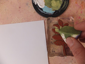
Step One: Use a cosmetic wedge to apply Guacamole Fresco Finish, then Tinned Peas Fresco Finish paints onto the Eclectica ESN20 leaf stamp. Spritz it lightly with water, then stamp onto white cardstock. If you don't get the perfect impression the first time, just spritz, tap with paint and try again. When you're done, be sure to clean the stamp right away.


 Eclectica ESN20

Step Two: Once the paint is dry, either punch or die-cut it into a shape. If you're die-cutting, use some washi tape or stencil tape to hold the metal die in place before running it through the machine.


Step Three: Use the cosmetic wedge to apply London Night Fresco Finish to the edges of the shape. I apply a very thin edge, then let it dry a bit, then go back and blend it out with a clean part of the cosmetic wedge.


Step Four: Use the brayer to lightly apply London Night Fresco Finish to the left side of a piece of white cardstock. Let it dry—it won't take long.


Step Five: Cut two uneven strips of green cardstock and one strip of sheet music. Glue them along the left side of the white cardstock. Use black ink to stamp "reverie". Tip: I like to position the strips and the focal before stamping the word, just to be sure I have the elements placed correctly. Trim off the ends of the strips or fold them to the back of the cardstock.


Step Six: Use foam tape to adhere the stamped focal to the white cardstock.


After that, simply mat the piece on gray cardstock and glue it to the front of a card. Add gray cabochons at each corner and a knotted piece of black and cream ribbon. 

The embellishments will add another hint of contrast and dimension: The cream of the ribbon highlights the cream sheet music paper, while the blue cabochons coordinate with the London Night brayered area. Everything is in crisp contrast to the white space background and help the stamped focal come forward. 

Hope you've enjoyed this project! Some other ways to expand on the general theme—instead of brayering on your background, try a stencil pattern. Or instead of literal white space, opt for the same layout with cream or black. I'd love to see what you do with white space so please feel free to share!

Thanks so much for joining me tonight! For more ideas, please stop by
my blog or
You Tube channel

Thanks Sara, I am always so impressed when minimal colours and elements can create such a strong visual piece. The linear elements behind the stamped image really help with the overall clean look. ~Darcy 

We would love to see how you interpret this White Space topic by linking what you make to our 2016 Challenge #8: White Space, on this page HERE.
All of our bloggers love to see your twist on their ideas,  particularly if you were inspired directly by their post. 
All links go in the draw to win a £50 voucher to spend on products of your choice from the PaperArtsy online store. The White Space link will close 17:00 (London Time) Sunday, May 1st 2016. The winner will be announced 2 hours later at 19:00.