Hi everyone,
It's Claire Snowdon here with you today.
I've been enjoying some creative time lately making smaller pieces of art for a change. This topic is all about Seth Apter - but I decided to have some fun and do a Seth Apter/Scrapcosy mash up post! I'm really looking forward to sharing with you how I combined these two very special designers.
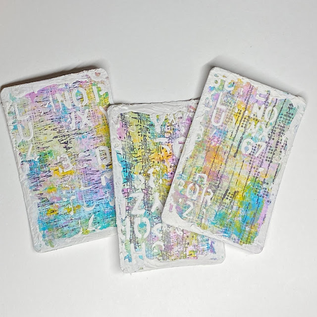
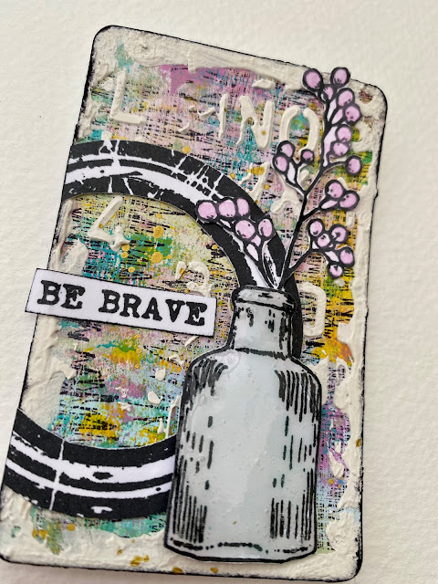
I really loved creating using these playing cards as my starting point - I think they are just the perfect size to showcase these beautiful Scrapcosy flowers and vases. I went for a slightly grungy look in the spirit of this being a Seth Apter topic! However I have definitely managed to add in a more feminine twist on your typical grunge project.
I started out with three playing cards and used my brayer to layer up
PaperArtsy Fresco Finish Chalk Acrylic in Fuzzy Cactus and Cerulean. I always feel using the brayer is a great way to start to break up that plain white background and just get some colour down.
Once I had the
PaperArtsy Fresco Finish Chalk Acrylic down on the cards in Fuzzy Cactus and Cerulean it soon became clear to me that these two colours alone were not the look I wanted - so to inject some more colour into my project I added Lily The Pink and Yellow Submarine.
I choose the Yellow Submarine for it's translucent qualities - it adds an amazing pop of colour to any project but without obscuring the layers underneath.
I added the additional two colours to my playing cards using the brayer. Then to soften the background and get rid of any remaining white spaces I added some water to the remaining paint on my craft sheet and applied it gently to the cards using my fingers.
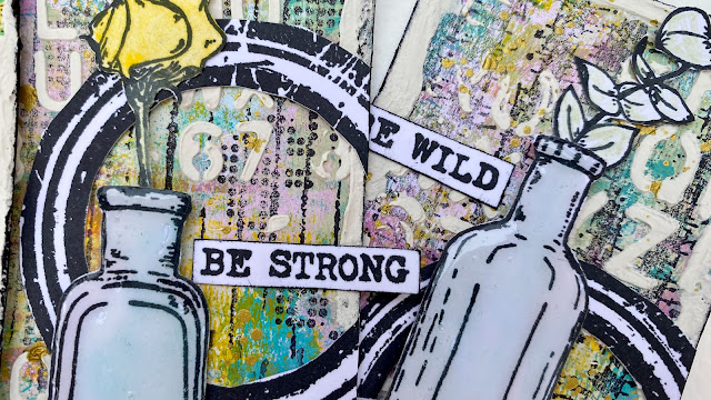
I stamped out a couple of the images - one from Seth Apter
ESA35 and one from Scrapcosy
ESC39 and started to play around with the composition.
Using stamped images in this way and layering them up on a project in various different compositions is one of my favourite ways to create any project - it allows you to visualize how the project will come together and what looks pleasing to the eye.


5 comments:
Brilliant project. I love these !
I love these cards, Claire; the colours are just beautiful. Helen x
I love the colours too - the Grunge Paste makes the other colours pop. Good idea to put it round the edges.
WOW..............What a great post, just loving all the details you have shared. Such beauty in each piece. Sometimes I feel like I live under a rock, I think aging takes away the imagination of being creative. Thanks for sharing, I think rum chata in my coffee might help???
Great post Claire. You’ve done Seth proud with your backgrounds. Love how you have combined different designers. Perfect. Xx
Post a Comment