
Hi everyone, it's Victoria with you today, and I'm here to share with you a wall art triptych using a selection of stamps designed by Kay Carley. The best facet of mixed media art is the almost limitless interchangeability of mediums and materials. Fabric and paper is a particularly marvellous combination and there are many, many options to create with them. Creating a wall art piece with stamping on fabric has long been on my to-do list, so this topic was the perfect opportunity to finally put some of those ideas into action.
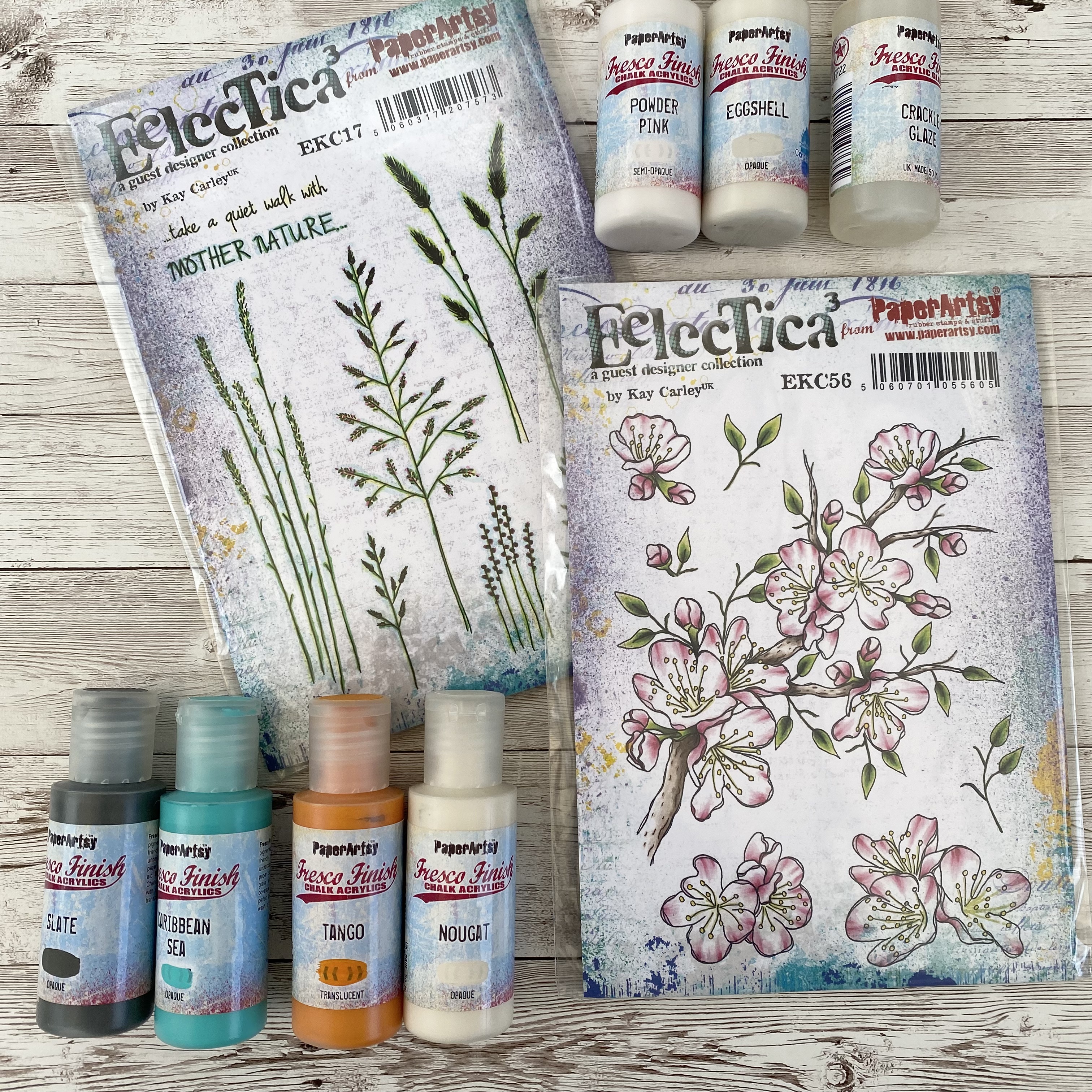
My first task was selecting a colour scheme and some stamps to incorporate in the piece. I always tend to keep to a limited colour palette and have a love of neutrals, so I decided to keep the habits of a lifetime but introduce a pop of blue and orange here and there. I selected PaperArtsy Fresco Finish Chalk Acrylics in - Eggshell (FF138), Nougat (FF39) Powder Pink (FF220), Tango (FF72), Caribbean Sea (FF94) and Slate (FF84). I also picked Kay Carley stamp sets EKC17 and EKC56 for their simple elegant floral elements.

I decided that I wanted to make three oblong strips made of a range of papers and fabric to make a triptych piece, so I started off my project by creating a series of papers. I selected some old book paper and a sheet a grid paper (containing my sons old school work!) from my paper stash and applied a layer of PaperArtsy Fresco Finish Chalk Acrylics in Eggshell (FF138) and Powder Pink (FF220) on my gel plate to knock back the text so it didn't overpower the finished piece.
I then used a piece of white paper and covered it roughly with PaperArtsy Fresco Finish Chalk Acrylics in Caribbean Sea (FF94) using a brayer.
I then used PaperArtsy Fresco Finish Chalk Acrylics in Tango (FF72) to add some contrast colour.

With the collage papers set aside to dry, I started to create the floral elements for the oblong panels. I started by stamping and embossing cherry blossom flowers using EKC56 and Distress Embossing Glaze (in Antique Linen, Vintage Photo and Walnut Stain).
I then applied some background colour to the paper blossoms using a blending brush and Distress Ink (in Faded Jeans and Vintage Photo).
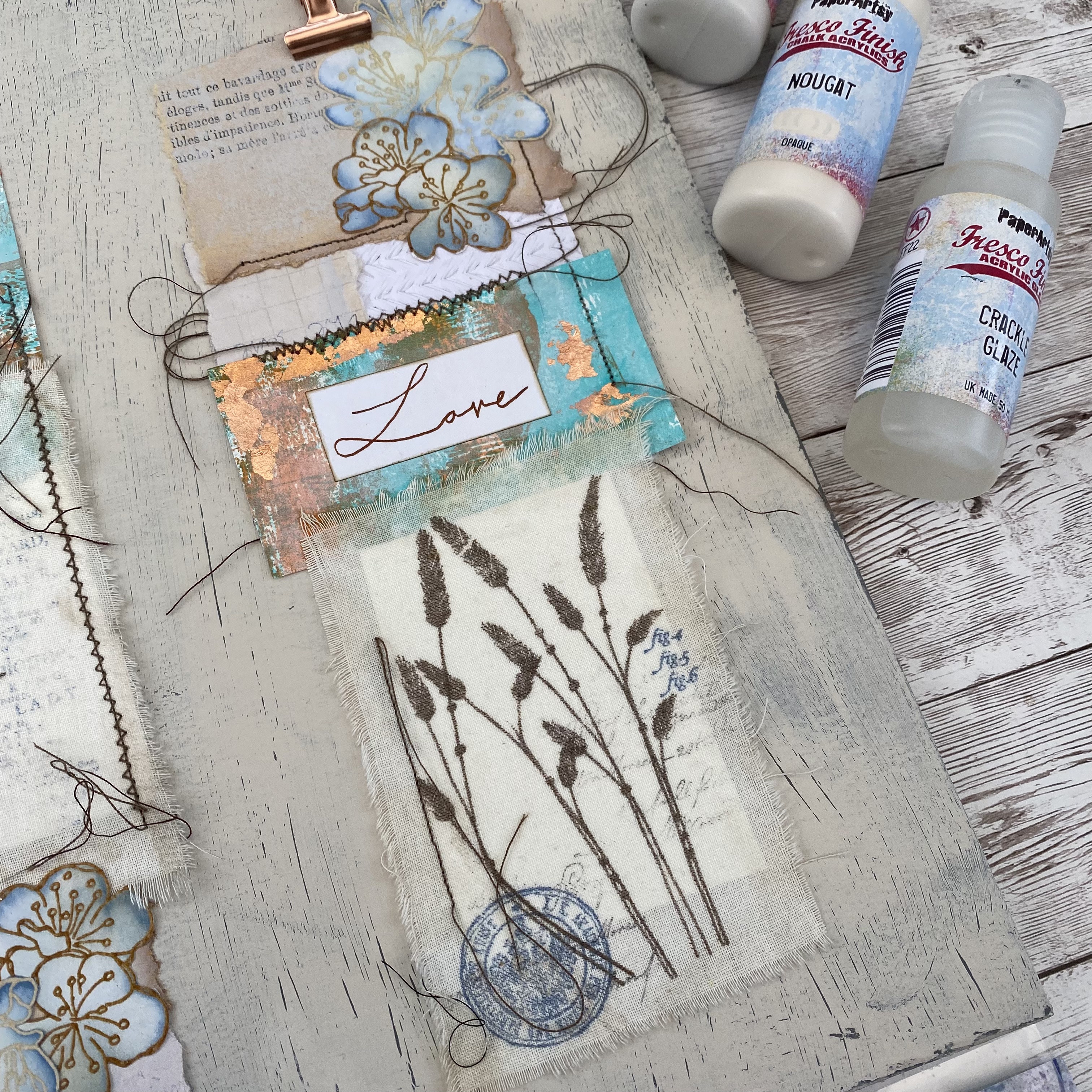
Next up were the main focal points of the piece, the floral fabric elements. I tore three pieces of cotton fabric in different sizes, from a larger piece of fabric, creating rough edges. I then stamped elements from EKC17 in Distress Archival Ink (in Ground Espresso).

The final stage of the make was creating the background board to bring all the elements together. I wanted to create a subtle distressed effect which would give some gentle detail without detracting from the three oblong panels. For this I used an A3 piece of greyboard and started off by giving it an all over coat of PaperArtsy Fresco Finish Chalk Acrylics in Slate (FF84).
To create a distressed effect to the background, once dry I gave the grey board an overcoat of Crackle Glaze, applying it in a think coat with a palette knife.
The final step in creating a distressed effect was applying a top coat of PaperArtsy Fresco Finish Chalk Acrylics in Nougat (FF39).
With the back board drying, I started to assemble the three oblong panels, using the fabric and background paper pieces. I experimented with different combinations of shape and size until I had three unique panels I was happy with. For a final bit of detail I added some additional stamping using text and circular stamps from Alison Bomber (sets EAB24, EAB25, EAB26) and some Copper Guilding Flakes for a metallic accent on the coloured card. Once assembled I added some machine stitching to secure the various elements on each panel, leaving the loose threads for some extra texture on the finished piece. The final step was attaching the paper blossoms and a hand lettered sentiment to each of the three oblong panels.
The project was completed by mounting the three panels on the background board, with a mini rose gold bull dog clip as a faux hanging element.
The simple floral stamping is really effective on the finished piece. The basic colour palette really helps to ensure the finished piece isn't too busy and lets all the textures from the different elements lead the eye around the board. The pop of blue and orange is just enough to help distinguish the three panels from the background. The crackle effect to the background didn't turn out as pronounced as I'd hoped and in hindsight I should have used the paint more generously on the top coat to get more pronounced crackles.
I hope this has inspired you to have a go at stamping on fabric as a different substrate. I'd love to see what you make so don't forget to share and tag me on social media.
Wishing you a happy creative week
Victoria


4 comments:
This is so beautiful!
Wow ... that is so lovely ... thanks so much for the step-by-step process
Very delicate and beautiful.
Absolutely magical, Victoria. The subtle colour tones and soft textures are perfect with Kay’s lovely stamps.
Alison x
Post a Comment