

Hi everyone, it's Peley Renata with you today, and I'm here to share with you a very feminine and vintage art journal page I made using products designed by three very talented ladies: Tracy Scott, Nicci Battilana and Scrapcosy.

When we start making an art journal page or any sort of artsy project, we all draw inspiration and ideas from various places. We can get inspired by color, by image, by something we saw or who knows what, it can be completely subconscious. I for one really enjoy costume movies, so it won’t surprise you when I tell you that for this art journal page, I got my inspiration from the girl stamp, in the latest release by Nicci Battilana. I right away thought of her as a duchess, as this royal, elegant lady, living in her 16th-17th century castle, sipping tea and reading poetry.


To be able to better decide on the size of the background paper, this time I decided to start my project by preparing the images first. I colored the girl and the brooch from the stamp set ENB11 by Nicci Battilana, and some flowers and a butterfly from the ESC23 stamp set by Scrapcosy.
On the image below you can see me coloring, while my image is fixed on the stamping platform. The reason behind that decision is that my watercolors were a tad bit opaque as they were pastel shades, and they dimmed the black outlines of my images. So, after coloring one image I just re-stamped it in order to bring back some of that firm outline.


After coloring the images, I fussy cut them and with a black brush pen I went over those white edges. Maybe I keep repeating myself, but I really do think this is a very important step. It helps the cutout images to look better and it gives a bit of a shading effect. My advice is not to be lazy, don’t rush and do those tiny details because at the end, those details are what raises your work to the next level.


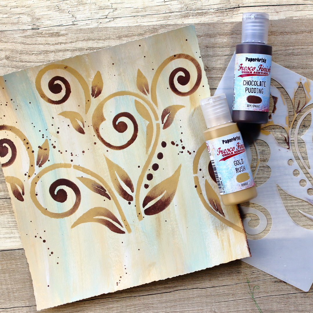
As you can see, my images were prepared and it was time to start working on the background. For this, I chose several PaperArtsy Fresco Finish Acrylic paints in shades of brown. Starting from the brightest, my chosen colors were: Nougat, Sand, Gold Rush and Chocolate Pudding. Also, when considering the color scheme, I like when my background contains some of the colors that are present in the images. I think it makes the whole project more cohesive. For that reason, I decided to include a small amount of blue color (Paper Artsy Fresco Finish Acrylic Paint Smurf) in my background as well, since it can be found on my girl’s clothing.
Oh, and I forgot to mention that I cut my base paper in a way that it would have deckled edges. I felt like that contributes to the “old paper” look and gives it more a vintage effect.
As working with acrylics can be a quite messy process, I moved on to work on my glass mat as it is much easier to clean.


I personally really enjoy the looks of the brush strokes, so I decided to mix my colors directly on the paper. I started with the brightest shades, and slowly added darker ones. The good thing when working with acrylics is that you can mix and keep adding the colors until you reach the desired result. And if you are not happy with how it turned out, it means you are just not done yet. In the worst case, just put on it some white gesso and start over. With acrylic paints, it’s hard to go wrong as long as you respect color theory.

As soon as the base color was done, I took the Tracy Scott stencil PS155. This time I didn’t want just simply to stencil in one plain color but instead, I opted in for some ombré effects. I wanted the stencilled shapes to be a bit darker in color so I was switching between PaperArtsy Fresco Finish Gold Rush and Chocolate Pudding. I was always making sure to cover with a masking tape the areas that I didn’t want to accidentally put in the paint. Also, on purpose I didn’t stencil in the lower portion of the background, since I knew that area would later be covered with the flowers anyway.
Oh and of course I put some splatters as well. You can see on the picture that I added splatters in Chocolate Pudding color, but on later pictures you can see that I added some pinkish ones as well, since I had that color on my flowers.

One more thing that I enjoy doing for my art journal pages is darkening the edges of the paper. I think it helps pull the viewers eyes to the focal point and honestly, I just feel my page is incomplete without it. For that, I again used the Chocolate Pudding color.


At this point, both my background and my images were ready and it was just a matter of assembling it all together. The first thing that I did was to adhere my page to a black background. There is no particular reason for it this time, I just enjoy how it looks. For this purpose, I used double-sided tape. But adhering my page to the background just felt too plain, so I decided to spice it up a bit and add a bit of a lace to one side.

Now I have a confession to make. At this point I started to worry my project would be just flat and boring. I felt like I was missing that special something to it. After a bit of brainstorming I realized that I liked that bit of lace at the edge so much that I just had to put it somewhere else too on my project. And at that moment I had this idea. As I said at the beginning, I imagined my girl to be a duchess, so I wanted to further embellish her royal outfit. First, I gave her some shoulder epaulets with the same lace that I already used for this project, and then using skeleton leaves, I gave her a Medici collar.
A bit of bonus info is that a Medici collar is a type of ruff that was worn in the late 16th and early 17th century. It stands upright in the back of the neck and it is open in the front. It was introduced by Marie de’ Medici after whom it was named.

I wanted this project to have dimension, so for the majority of the elements I have used a foam tape. And then, when it comes to the final touches, sometimes I have a hard time stopping myself. Anyway, tell me how can you imagine some royal lady without her pearls? Well, I couldn’t, so I added them on her epaulets and made her necklace to be a pearly one. I also added some glitter on certain parts, like duchess’ jewelry and collar, flower centers and the butterfly.

I forgot to mention that before doing all of these extra embellishments, I prepared my silhouette brooch. I used Glossy Accents to give it that glassy effect and I also put there some pearls, so it would better match the rest of the project. The other thing that I prepared was my quote. The sentiment came from the same stamp set as my duchess and I heat embossed it on a black piece of cardstock.

While I had Glossy Accents on my table, I used them to add a few water looking drops on my flowers and to add some dimension to the roses in the duchess’ hair. And I guess I had to stop myself from adding more details. So here is how it all looked at the end.


As I mentioned, at some point I started to worry this project would look too plain, but then I got this idea to use the lace, skeleton leaves and pearls and I got so excited that I had a hard time stopping myself from adding too many details. Sometimes all of us feel like our project is missing something but then again we fear adding more because we are afraid that we might ruin what we made so far. My advice – don’t be afraid! Art journaling is supposed to be fun and to bring joy. What can help if you feel stuck is to walk away, do something else for a bit and then come back. That almost always helps me to get a new perspective and idea.
Anyway, I hope you enjoyed my process and that you like the new stamp set from Nicci Battilana. And take a look, she has some other amazing stamps and stencils in her latest release as well. 😊
Renata 💜

Instagram: @renata_artjournaling


3 comments:
Merci, Renata, for your glorious journal page! I see Marie Antoinette and your use of that flourish stencil in the background is a perfect element to this design! Seeing those stencils when they first were released "nudged" me but I wasn't creative enough to see the possibilities. Now you have given me that extra "nudge" and I must have these 3 stamps on my horizon! Your suggestion of using a dark color to shade and hide the white on the edge of the cut-outs really does add to the allure of the finished project. This is just what I needed for a friend's birthday card which is on my To Do List for this afternoon. I will use your suggestions even though I will be choosing other stamps that are in my inventory at present. You have achieved your goal: 1)you've given me some new ideas on how to "up my game"! 2)shown me how to use that gorgeous stencil in the background and 3)pointed out how some little additions (adding lace and continuing to come up with little additions to help "tell my story"! SUCCESS!
Thank you so much Mary. I really loved reading your comment and your thoughts. Seeing people get inspired by my work really makes my day. :)
Thank you very much Mary. I loved reading your comment and your thoughts. Seeing people inspired by my work really makes my day. :)
Post a Comment