2020 Topic 13: Lines

Dounia's
gel plate has been in overdrive creating some incredibly intricate
pages. She takes us through the process really clearly and the layers
are really well defined and finished with some contrasting lines. Her
explorations have resulted in such a lovely project and we'll have to
ask her for her home-made gel plate recipe, which works so perfectly!
~ Keren
~ Keren
Hi everyone, it's Dounia with you today, and I'd like to share with you a project mixing gel printing and line art.
Smooth
lines on clean paper are always striking but I also like them popping
out of a busy, even messy background. I therefore used this opportunity
to mess with my gel plate then play mix and match on the theme of
circles.

There
are hundreds of ways to use a gel plate but after some experimentation,
I found I prefer to build layers on the plate and on the paper. Among
my favorite tools for that are rubber stamps as they can provide both
background patterns and focal images. Lin Brown has an amazing line of stamps designed just for that! For this project, I used ELB29 & ELB34. The leaves are gorgeous and my lazy self likes making found objects textures without having to find the objects!


I like to start by adding color to the clean plate using the stamps with Fresco Finish Chalk Acrylic paints.
I don't worry too much about placement or colours, I just try to be
fair and distribute patterns evenly. Here I had a blue palette in mind
but I began with accent colours Butternut, Autumn Fire and Brown Shed.


(Don't
mind the color of my gel plate, it is homemade and has been melted down
and recasted a few times). Over that first texture, I brayered a layer
of my main colours: Sargasso, Paua Shell and Smurf. I then used the stamps to take off some the paint layers.

I
always try to mix bolder stamps with finer ones for more texture. The
holes in this paint layer will let the third one appear. As the previous
paints are opaque, I can use a selection of darker blues and greens for
this last step before the print: Hyde Park, Space Cadet and Midnight.


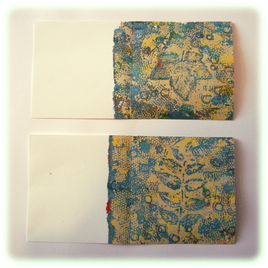
Here
are the prints. They are quite busy but I like trying lots of
techniques, colours and stamps on the same plate. It gives me an idea of
what works together and what doesn't. For example here I think I used
too much of the contrasting colours, which muddled the palette.
I
then repeated the process with new combinations and had fun! I like to
keep my selection of colours relatively tight. That way the prints will
form a coherent ensemble and can easily be used in the same project. In
the next round, I focused on a cream look, using Buff, Sand, and Haystack, with a brown contrasting final layer of Toffee, Mud Splat & Chocolate Pudding.


Of
course I want to still see the beautiful background I worked hard for,
so after brayering the paint on the plate, I take off as much as I can
with the stamps.
Here
is the result on the blue backgrounds. (But not using the layer picture
above because I was focused on the time sensitive printing and forgot
to take pictures consistently, sorry!) A good contrast between the
background and the top layer is crucial for the focal image(s) to be
visible. I had some struggles with that... (that's why you won't see the
cream and brown background again).
Finally,
it is time for the actual lines! I think they really play well with
prints as they can isolate and emphasise the focal stamps that would
otherwise be lost in the texture. I tend to stick to simple designs that
will work on a bumpy surface: winding lines, hatchcrosses, simple
geometric shapes... (little circles count as lines, right?)
 Also,
if the background is not that interesting, the line can be the focal
point. I used that trick in some of the following pages. As I was
planning to bind them together in a book, I chose a common theme for my
lines. I went with circles, because they are quite versatile and go well
in square pages.
Also,
if the background is not that interesting, the line can be the focal
point. I used that trick in some of the following pages. As I was
planning to bind them together in a book, I chose a common theme for my
lines. I went with circles, because they are quite versatile and go well
in square pages.
 Here
is the finished book. For the covers, inside and outside, I used
by-products of my printing session: Papers here I "cleaned" my brayer
and my stamps with. That way I am sure they will color match!
Here
is the finished book. For the covers, inside and outside, I used
by-products of my printing session: Papers here I "cleaned" my brayer
and my stamps with. That way I am sure they will color match!
I
hope this encouraged you to try lines on a busy background. It doesn't
have to be on gel prints (even if those are fun!). I know I have pattern
papers or scraps from masterboards with hidden gems that could be
"revealed" by some contrasting lines, and you probably do too! They can
make an easy focus element on a card or an embellishment on scrapbooking
project so don't hesitate to give it a go!
Stay safe and creative
Dounia x


No comments:
Post a Comment