2016 Topic 22: Alcohol Inks and Pens
Hi Everyone! Caz here tonight with my project using alcohol inks in various forms and Elizabeth Borer stamps. I’d not done much with alcohol inks recently, so this was a good excuse to break out the pens, ink bottles, ink pads and various papers/cardstock and remind myself how these inks perform!
I was pleased to be asked to work with Liz’s stamps again after the last piece I did for the Paper Artsy blog – I do love how they lend themselves to lots of layers and I decided to do a piece with a Creative Frame wooden kit from Anna Marie Designs.

Step 1: Planning! I thought this time I’d work in a different way to normal and actually ‘plan’ what I wanted to make rather than just going with the flow, especially as I was going to need so many flowers for what I had in mind.
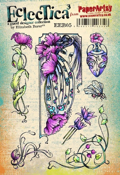
So I chose stamp set EEB05 as my main source of images, some small flowers and corner image from EEB08, the words from EEB05 and the flower spray and bee from EEB04.
So I chose stamp set EEB05 as my main source of images, some small flowers and corner image from EEB08, the words from EEB05 and the flower spray and bee from EEB04.
 |
| EEB04 |

I stamped loads of images on plain card to start with and cut them all out. After playing around with the placement for a while, I decided on this layout and took the photo so I wouldn’t forget!

Step 2: To help decide on the colour scheme, I laid down some swipes of colour on Ranger Alcohol Ink Cardstock with a blending tool. I then pounced on some bands of pearl mixitive, blending solution and then some isopropyl alcohol, just to check what effects I got and if it was what I wanted for the background.
I loved the way the blending solution and isopropyl each worked slightly differently moving the colour around which I thought would be particularly useful for the sky.
I loved the way the blending solution and isopropyl each worked slightly differently moving the colour around which I thought would be particularly useful for the sky.

Step 3: So this decided the possible ink colours for my background. Using some very glossy paper which has “decoupage printing” on the packet – I have no idea where it came from but the alcohol inks seemed to behave well on it - I pounced the inks on blending the stripes as I worked up the paper: Clover and Limeade together blending into Patina and Limeade together, blending into Limeade then into the sky with Sail Boat Blue.
I added touches of Pearl Mixitive and blending solution to the sky, and then the cloudy effect was helped with drips of isopropyl alcohol being allowed to spread where they wanted.
I added touches of Pearl Mixitive and blending solution to the sky, and then the cloudy effect was helped with drips of isopropyl alcohol being allowed to spread where they wanted.

Step 4: On to the frame images - I stamped the focal image from EEB05 with archival ink on plain card and also the small flowers and corner image from EEB08. I coloured these with a mixture of Promarkers and alcohol inks.
The poppies were done with Poppy and Maroon Promarkers and then I blended them with alcohol inks – Flamingo, Mountain Rose and Valencia - and helped the colours to blend with some blending solution...all this done with the window open! I love how using the pens and inks worked but you definitely need plenty of fresh air!
The poppies were done with Poppy and Maroon Promarkers and then I blended them with alcohol inks – Flamingo, Mountain Rose and Valencia - and helped the colours to blend with some blending solution...all this done with the window open! I love how using the pens and inks worked but you definitely need plenty of fresh air!
I used a selection of Cool Greys for the hair and used silver Promarker for the border. I then used Promarkers for the smaller frame flowers in China Blue, Cornflower and Pastel Blue. Finally the corner flower spray was done with the same reds as before, and I used Clover and Limeade alcohol inks for the leaves.
 |
| EEB05 |

Step 5: Now, as I was happy with the colours I was using, I moved on to the flowers for within the frame. I wanted to achieve depth without using layers this time so I decided to use Whiteout Clearly for Art so I could heat and bend it. I worked out how big an area I needed for each colour by using the original flower templates that I’d made.
The poppies this time were Flamingo and Watermelon alcohol inks with a little dash of Pearl and then some Raisin towards the bottom and Clover and Patina mixed for the leaves area with some drops of blending solution to add interest.
The lilies were Valencia and Sunshine Yellow mixed and I dragged Clover down for the stem area. I also made a patch of Silver and Pearl Mixitive for the urns. So here’s the Clearly for Art ready for the images to be stamped with black Stazon ink. (memo to self...using cheap felt to make replacement pads for the tools is not always a good idea as it leaves fibres everywhere!)

Step 6: Once I’d completed all the fussy cutting of all the flowers and leaves, I then gave all the pieces some ‘movement’ using the heat tool and a wooden prodder to bend them over. I love using Clearly for Art as it gives so much scope to make things like flowers and leaves more interesting.

Step 7: I made the frame covering by using Silver and Pearl mixitive again pounced on the same ‘decoupage paper’ as the background....this time I dripped some of the isopropyl alcohol on the blending tool afterwards and made swirling shapes into the silver to give it a different texture.

Step 8: The final elements of the bees and the band of flowers along the bottom were made with some clear Clearly for Art – I decided I wanted a more delicate flower than using the Whiteout and also the bees wings needed to be on clear. This stage took a little bit of head scratching – until I had a light-bulb moment and added some Snowcap to the Valencia and Sunshine Yellow to make them opaque and show up better on the surface!! Sometimes the obvious takes a little while to work out!! J
Step 9: Lastly, the sentiment was stamped with black Stazon ink onto plain card, cut out and edged with Maroon Promarker, and the sprays of flowers for the sides (EEB05) were stamped on the same card and coloured using the same ink colours as the poppies

So here is everything ready to be put together:

Step 10: Everything was put together according to my trusty photo of the prototype......apart from some people may notice the final piece has flowers along the bottom not the top of the piece as I decided to have more of the sky showing and extra bees. I also changed the words to be cut out as a block as I felt it looked better with all the flowers around it. I’ve used Cosmic Shimmer glue for flat sticking and Pinflair Glue Gel for the layering. Some fluffy garden string added for a hanger and it was time to step back from the piece and stop fussing with it!

I really enjoyed this project as alcohol inks are not one of my normal ‘go to’ things and it was good to try them out again on different surfaces and remind myself how they reacted and the interesting effects that can be achieved. I’d not tried colouring using the Promarker/Alcohol Ink combination before and that is something I can see myself using again soon as I found this way of blending colours a lot easier. I’d also not used the Isopropyl alcohol before (donated from hubby’s shed – I didn’t ask what he usually uses it for!!). It was interesting to see how it ‘moved the ink’ around compared to the Blending Solution – Isopropyl seems to leave a more pronounced colour edge to where it spreads.
Lots of ideas now for future projects and I hope you will have a play with alcohol inks now too
Happy Creating
Caz
Blog: Candelle Creations
Wow Caz, so much fussy cutting, you are a star for doing all that. Definitely worth it though as the end result is stunning, all those resulting layers really pack a punch when it comes to the wow factor. Beautiful colouring, and curling the flowers and leaves works brilliantly. ~Darcy
Wow Caz, so much fussy cutting, you are a star for doing all that. Definitely worth it though as the end result is stunning, all those resulting layers really pack a punch when it comes to the wow factor. Beautiful colouring, and curling the flowers and leaves works brilliantly. ~Darcy
All of our bloggers love to see your twist on their ideas, particularly if you were inspired directly by their post; so please spare a moment to comment or make your own creative item. They all love to see your feedback and what you can do more than you realise!
We would love to see how you interpret this Alcohol Ink and Pens topic by linking what you make to our 2016 Challenge #22: Alcohol Ink and Pens on this page HERE. The Alcohol Ink and Pens link will close 17:00 (London Time) Sunday, Nov 27th 2016. The winner will be announced 2 hours later at 19:00.
All links go in the draw to win a £50 voucher to spend on products of your choice from the PaperArtsy online store.


12 comments:
Totally gorgeous project Caz....love it!
Totally gorgeous project Caz....love it!
All that fussy cutting would give me a panic attack, lol!!! ;-) A lovely piece, Caz, well done.
Hmmm yes... you wouldn't catch me doing so much cutting, respect!
I love the background, it reminds me the impressionist style.
oh, Caz, this is beautiful!! your patience with that cutting is unbound!
So beautiful! Cool fussy cutting! xxx
THAT is a fussy cutting EXTRAVAGANDA Caz. It looks great. I salute you. Lx
Gorgeous project Caz and the fussy cutting is right up my street. Beautiful shading with the alcohol markers and the background is fabulous. Totally stunning piece that obviously took a fair bit of time and patience but what a result!
Hugs
Lesley Xx
One word for you - dedicated!!! That fussy cutting is extraordinary!! Well worth it though the dimension looks stunning!! Amazing project.
Well done Caz. Fabulous layout and great finished result! X
Wow! What a beautiful project, Caz! I love those Liz Borer flower shapes and you have used her stamps so well on this delightful project. xx
Thanks to everyone for the lovely comments. I loved using Liz's stamps again and they really do make for a great fussy cutting project...... I think I might be having a "scissor break" for the moment though ;-)
Post a Comment